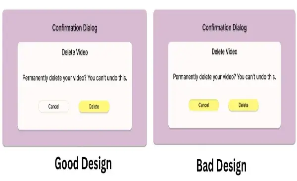
Before Start Good Design vs Bad Design: With 6 Examples. Let us understand Why Bad design is important and good.
Why Bad design is important and good?
Bad design can be good in certain contexts because it is usually a learning process. It brings attention to the user’s frustrations, allowing designers to see what does not work and where there needs to be changes. Equally poor designs can ignite a creative fire within people and catalyze ideas leading to better designs.
Good Design
- The essence of good UX design is in responding to users – creating experiences that are simple, effective, and even fun to engage with. It entails transparency and the serving of purpose, such that a user can easily operate without difficulty performing any action. By its nature focusing on simplicity and understanding the user’s state of mind, good UX design aims to reduce negative experiences and increase positive ones while also making sure the developed products are not just usable but also quite desirable.
Bad Design
- In contrast, the absence of good UX design puts more emphasis on the process than on the user making the process more in the end ineffective. It does not communicate, gives no comfort, and often fails to assist the user in completing the required task. Such designs make the experience better while making the product or service less effective than it should be.
6 Key Differences of Good Design vs Bad Design
Simplicity in Operation.
- Good Design: Leaning towards making the product user-friendly, where the user can understand it and operate it without reading a user manual or any other usage instructions. For instance, clear labeling of the products, rational ordering of elements, and placement of relevant controls.
- Bad Design: More often than not has an ambiguous set of instructions, concealed features, or a complex design. The user may have to fiddle with it or look for what is not readily available, and this can be quite annoying
Usability
- Good Design: Takes into consideration the wide range of users including those who have some form of disability. These consist of things like large font sizes, high contrasting colors, images with content written in a different text and other languages, and so on. For instance, when it comes to physical products, it could be shapes that are more inventive and easier to use.
- Bad Design: Unable to design or accommodate such features which the other users will also be able to utilize hence becoming difficult or impossible for some individuals to use. This could be a very low-contrast website for a person or a door without an easy-turn handle for a person with mobility issues.
Feedback Mechanism and Level of Responsiveness
- Good Design: Communicates promptly and effectively to the user and acknowledges that something has been done. An example can be sounds, vibrations, or blinking lights indicating that an entry has been made. For instance, an ATM that displays a countdown timer while processing the transaction.
- Bad Design: Does not give out any confirmation or gives out some contradictory confirmation making the user not sure if what he/she did was successful. A case in point is a microwave that has no bell at the end of the timer, leaving the user in doubt as to whether the cooked food is ready or the cooking is still on.
Effectiveness and Efficiency
- Good Design: Simplifies work processes, thereby lessening the amount of effort and time taken to accomplish a specific task. It allows users to perform tasks in the shortest time possible and use the least energy. One such device is a remote control unit that has all the keys associated with commonly done tasks, such as changing the volume and the channel.
- Bad Design: Is cumbersome and involves a lot of unnecessary steps or making the user do an action over again. For instance, an icky coffee maker that is easy to operate the user is presented with a lot of settings that take time to understand before one can make coffee.

Coffee Maker
Aesthetic Considerations and Attractiveness
- Good Design: Good design should be pleasing to the eye, balanced, and appropriately focused.
- Bad Design: Disorganized, inconsistent, and unprofessional-looking.
Stability and Uniformity
- Good Design: Model colors, layouts or any other components assist users in navigating the design.
- Bad Design: Non-uniform design creates confusion and hinders the navigation process.
Conclusion
In the end, a well-designed object improves the user experience whereas a poorly designed object hinders the user experience. The most effective designs foresee what the user would need and what problems they may come across. In contrast, unfitting designs ignore such factors causing irritation and dissatisfaction more often than not.
Frequently Ask Questions
A good design seeks to promote ease of use, aesthetics, and clarity to enhance the overall user experience. In contrast, a bad design is one that looks ugly and is very difficult to understand and use hence it being in most instances frustrating and ineffective.
It assists the users in that, they know what to expect from a product and this guides them in the interaction process. When the design is not consistent, it creates an ineffective user interface as the user will spend a lot of time looking for things.
User feedback assists designers in understanding what is effective and what is not. In most cases, good design incorporates user feedback in a bid to make the design more usable while in the case where feedback is ignored, the design tends to be bad since it does not consider how actual users operate or their pain points.

"Discover 11 Instagram Trends to Elevate Your Strategy in 2024" - Digital AniViPractice
[…] content typically associated with Instagram, offering a more casual and authentic portrayal of real life. These dumps include a mix of different image types and qualities, embracing the charm of blurry […]