Enhancing Your Blog’s Visuals with UI Tools (2025)

Enhancing Your Blog's Visuals with UI Tools (2025), digitalanivipractice

Enhancing Your Blog’s Visuals with UI Tools (2025)

In 2025, your blog is not only expected to be informational but also visually appealing. Users are looking for visual engagement, and that is where UI tools come into play. It does not matter if you are a lone blogger or a brand content creator using a team of bloggers — with the right UI tools, you can change your blog from “just another website” to a click-tastic, scroll-stopping experience.

In this guide, we are going to show you how to use these top UI tools to build a visually engaging blog that is also going to improve SEO and keep readers coming back.

Reasons Visual Design is Important in Blogging

You have about 3 seconds to capture a visitor’s attention. Good visuals can:

  • Increase time on site (an important factor for SEO),
  • Decrease bounce rate,
  • Increase shareability,
  • Make your blog content more memorable

A visually appealing blog merges typography, layout, color, whitespace, images, and interactivity into a single experience.

🧰 1. Use a visual layout tool, started as Figma or XD.

Why does this matter?

You should always prototype how you want the look and feel to be before you publish anything.

Figma and XD allow you to:

  • Plan your blog post and home page layouts
  • Discuss and determine the visual hierarchy
  • Create reusable components (headers, image cards, CTAs)
  • Collaborate with designers or developers
How to do it:
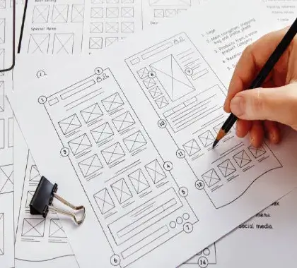
  • Create wireframes of your home page and blog post layouts
  • Apply spacing, padding, and responsive designs consistently.
  • Create a design system (fonts, buttons, icons, etc).

Pro Tip: Use Figma’s Auto Layout and Grid to position elements straight away and make them responsive.

🖼️ 2. Leverage Canva to Create Blog Images & Post Graphics.

Every blog post is going to need visual elements — whether that’s:

  • A featured image,
  • An infographic,
  • A Pinterest pin,
  • Social media preview.

Canva gives you an easy option, especially if you’re not a designer.

What to make with Canva:
  • Banners and thumbnails for your blog,
  • Quotes stylized with text,
  • Step-by-step infographic
  • Carousel graphics for Instagram/blog embeds.

You want the same colors, fonts, and templates to retain your blog identity.

🎨 3. Optimize Your Blog UI with Colors and Fonts.

Visual UI is more than images; it’s about color psychology and typography that contribute to readability and user sentiment.

UI Recommendations:
  • Use consistent color palettes (2-3 primary colors).
  • Use readable fonts for body copy (recommended 16px or more).
  • Pair fonts (bold headings + clean sans serif body text).
  • Give ample whitespace to reduce cognitive load.
Helpful tools:
  • Google Fonts -free, fast-loading typefaces,
  • Colors. co-generate color palettes,
  • Happy Hues -color combinations with real visual examples

🧩 4. Use Interactive Elements with UI Widgets.

Adding interactive elements keeps readers engaged longer and helps with UX. You may embed:

  • Tabs to help organize your content (FAQ, features of the product, etc.)
  • Accordions for FAQs or blog summaries –
  • Progress bars to show how far readers are into your article –
  • Scroll animations to make your content more dynamic
Tools: –
  • Elementor (for WordPress) – a drag-and-drop UI builder –
  • Shorthand or Tilda – visual storytelling tools –
  • Framer – for scroll-based animations and motion

UI UX Tip: Do not go overboard with animations – they should be subtle, quick, and have a purpose.

📷 5. Incorporate quality visuals and a B-roll.

Visual storytelling goes beyond just static images. Videos, GIFs, and B-rolls can bring your blog to life.

What You Can Add:
  • B-roll videos corresponding to your blog style (i.e., videos of a workspace, people using products)
  • Lottie animations (small animations created from SVGs for mobile)
  • GIFs that visualize a specific step or emotion.
Get started here:
  • Unsplash – Free high-resolution images
  • Pexels – Free stock video
  • LottieFiles – Lightweight animations
  • Giphy – For meme and emotion-based GIFs

Embedding Note: Use image compression programs like TinyPNG or Squoosh to help maintain site speed by compressing visuals.

📱 6. Mobile First – Use Responsive UI Frameworks.

Your blog needs to look good on mobile, where over 70% of your traffic is likely originating. How to be responsive:

  • Choose a responsive theme or UI kit.
  • Choose vertical layouts with stacked content.
  • Choose large tap targets (44px minimum height).
  • Test across sizes with Figma or Chrome DevTools
Tools:
  • Tailwind CSS – A utility-first framework that produces a fairly clear UI
  • Bootstrap 5 – A mobile-first grid system and UI components.
  • Figma Preview – This tool helps you view your design in mobile mode.

7. Understand What Works Using Visual UX Tools

Now that you’ve added some engaging UI, track what’s working.

Tools for Assessing UI Interaction:
  • Hotjar – Heatmaps and click tracking,
  • Microsoft Clarity – Free visual session recordings,
  • Google Analytics 4 – Track page scroll depth and engagement rate.

Use this engagement to inform your design, and get users to read more!

💡 Bonus UI (User Interface) Tips for Bloggers

  • – Implement a sticky navigation bar to reduce friction
  • – Use breadcrumb navigation in blogs with a lot of categories
  • – Visually distinguish related posts (for example, a grid of thumbnails, cards, or carousels)
  • – Use color-coded blog categories to aid users in scanning

Final Thoughts:

Great UI = More Clicks, More Time Spent, More Traffic.

Your blog isn’t just a collection of articles—it’s an experience.

With the right selection of UI tools, you can:

  • – Design visually compelling content
  • – Make navigation easier
  • – Create an incentive for repeat visits
  • – Enhance SEO with better UX metrics

Whether you’re designing a new homepage in Figma or creating an infographic in Canva, always be mindful of the user’s visual experience.

Frequently Ask Questions

What are UI tools, and how can they help bloggers?

UI (User Interface) tools are design platforms and design components that help you design enticing blog layouts, graphics, and interactive components. UI tools streamline layout organizing, optimize the user experience, and give your blog a refined and professional look, without advanced coding.

How do visuals affect my blog’s SEO and traffic?

Visuals make readability easier; improve dwell time and engagement, which decrease bounce rates and help to improve SEO signals. A visually optimized blog invites users to spend more time on it, interact with it, and share it.

Do I need a design background to use UI tools?

No! Tools such as Canva, Elementor, and pre-built Figma templates are simple to use for a beginner. Alternatively, you can begin working with drag-and-drop layouts and gradually build up the confidence to customize your blog’s visuals even further.

What Is B-Roll in Video Editing (2025)

What Is B-Roll in Video Editing (2025), digitalanivipracticeb

What is B-Roll?

B-roll footage is additional footage that complements the main footage, referred to as A-roll. A-roll is your primary video footage; it could be someone speaking directly to the camera. B-roll is additional footage that adds context or emotion to the viewer. B-roll is important because it keeps the viewer engaged. It adds context to the action and keeps your viewer from getting bored.

For example, if you are filming a video blog talking about video editing software, where A-roll would be you explaining what the tools do, then B-roll could be screenshots of you using the software program, close-ups of your hands editing short clips, and even your facial reactions!

Why B-Roll is Important in 2025

Why B-Roll is Important in 2025. More visual requirements: Users demand dynamic visual storytelling due to the rise of TikTok and YouTube Shorts. B-roll footage adds pace and polish to your edited videos.

  • Increase engagement: Videos that have interesting, creative B-roll and editing are more likely to retain viewer engagement for longer time periods. Watch time is critical for SEO and algorithm placement.
  • Improve clarity: B-roll is a visual representation of or clarity to what you are saying. Instead of talking about a product, show the product in action.
  • Increase buyer confidence: B-roll that has been shot well will have a professionalism to it, which will increase viewer confidence in your brand or blog.

B-Roll categories in 2025.

Here are the most popular types of B-roll content that creators use today:

  • Contextual B-Roll: Footage that shows someone doing whatever it is they normally do in their space – i.e., a video editor’s work desk.
  • Cutaway Shots: Related shots that are cut in quickly – i.e,. a clip of a computer screen or a shot of the timeline in Premiere Pro while talking about how to edit.
  • Establishing Shots: Are used at the beginning of a scene to establish where it is located. Reaction Shots: This is a shot of a person’s face or the audience’s response along with the video to help give emotion to the piece.
  • Product Close-Ups: Tight shots that showcase the tools or items you are talking about.

How to get Better Quality B-Roll in 2025

  • Plan Ahead: Include your B-roll shots in your script or storyboard – think of it this way: “What visual supports this statement?”
  • Use a Shot List: Make a checklist of B-roll angles and scenes you want to capture in your shoot so that you don’t miss anything.
  • Keep it still: Use tripods or gimbals to stabilize your footage.
  • Use AI Tools: Tools like Adobe Premiere Pro (with Sensei AI) and Descript can now suggest B-roll inserts based on your script.
  • Record More B-Roll than You Think You Need: You never know what will be useful when you are in the edit.

The Process of Cutting B-Roll into Your Videos

  • Overlay: Layer B-roll clips on the timeline directly under your main video A-roll so that it sits on top without disturbing the audio.
  • Cut-In & Jump Cut: Utilize B-Roll to cover jump cuts or amplifications.
  • Timing: Use the exact words or phrases in the dialogue whenever possible to increase the flow and impact of your editing.
  • Use Transitions Sparingly: Less is always more. You don’t need fancy transitions when your content is so great.

New Tools to Add B-Roll Starting in 2025

  • RunawayML: An AI video clip editing tool that will also suggest and enhance your B-Roll.
  • Pictory: B-roll is automatically generated from your script/blog post.
  • Storyblocks & Artgrid: royalty-free, but you can source higher-quality B-Roll.
  • CapCut & VN: mobile editing can quickly cut your B-roll on the go.

B-Roll Across Different Platforms

Platform Best B-Roll Uses
YouTube Explanations, tutorials, and reviews
Instagram Reels Behind-the-scenes, product close-ups
TikTok Reaction shots and transitions
Blog Companion Video Screencasts and storytelling shots

Optimizing B-Roll for SEO and Clicks:

  • Align it with Keywords: Use the B-roll that aligns with your video’s main SEO keyword (e.g., “video editing in 2025″).
  • Add Captions: B-roll with captions makes content more accessible and increases content retention.
  • B-Roll Action Photos as Engaging Thumbnails: Use action shots rather than the talking heads.
  • Repurpose B-Roll: Take snippets of your video B-Roll and use them as Instagram Stories, YouTube shorts, or blog gifs.

Common B-Roll Pitfalls:

  • Using Too Many Stock Footage Clips: It makes your video feel generic.
  • Unrelated Clips: The viewer loses context, and it dilutes your main message.
  • Too Dark or Choppy Footage: This can detract from a polished look.
  • Not fitting the narrative: You should always ask, Does this clip serve the story?

Conclusion

To summarize, B-roll is not just a visual placeholder, but rather a storytelling asset that every content creator must learn about in 2025. B-roll can help clarify your message, increase audience retention time, help your videos SEO ranking, and create a more engaging feel that separates you from the pack.

Whether you’re creating a vlog, tutorial video, or product review, adding purposeful B-roll can elevate your content from good to viral. So, organize your shoots, take that camera out, shoot some B-roll, and your audience (and traffic) will appreciate it. Want to Learn More?

  • 💡 Join our newsletter for weekly video editing tips.
  • 🎬 Enroll in our B-Roll Mastery course for an extensive training program for the best B-roll in 2025!
  • 📸 Follow us on Instagram and YouTube for strategies and samples!

Frequently Ask Questations

What is B-roll in video editing?

B-roll is extra footage in video post-production to complement the primary content (A-roll). B-roll helps to visually demonstrate what is being said, add context, variance, pacing, and secondary elements to tell a compelling story.

Why is B-roll part of video in 2025?

In 2025, B-roll is important to increase audience viewing retention by alleviating the repetitiveness in your content, creating visual interest, and supporting your content in an SEO-based content creation world on platforms like YouTube Shorts, Instagram Reels, and blog video content.

What types of B-roll are most impactful for content creators in today’s world?

The most impactful B-Roll in 2025: contextual clips, product close-ups, drone shots, screen recordings, reaction shots – and also leveraging AI-generated visuals in tutorials, reviews, or storytelling.

Can I use AI for B-roll footage?

Absolutely! In 2025, AI tools, like Runway ML, Pictory, and Adobe’s Sensei, offer suggestions or automatically generate any B-roll based on a script or blog post, providing video creators a quicker and smarter way to create engaging visual content

Where can I find high-quality B-roll footage?

You can shoot or make libraries of your B-roll, or reach for the best royalty-free libraries, like Artgrid, Pexels, Storyblocks, or Canva Video. In 2025, AI tools that provide B-Roll clips based on topics and niches expand into auto-generating and enhancing B-Roll clips.

Design Psychology: The Impact of Color on UX and User Engagement.

Design Psychology. digitalanivipracticeb

Design Psychology: The Impact of Color on UX and User Engagement.

Color is not just decorative — it can be a form of communication. Color is important in UX design because it helps guide users, elicit emotions, and incite action. Whether you are developing a blog, app, or landing page, the right colors can determine whether a visitor bounces or locks in a conversion. In this post, we’ll identify the psychology of color in UX design, how distinct shades of color influence user engagement, and how you can leverage color principles to increase user engagement, trust, and conversion via your blog or website. Design Psychology: The Impact of Color on UX and User Engagement.

The Importance of Color Psychology in UX

Color influences user attitude, interaction, and decision-making. Research shows that people make their impression of a product within 90 seconds – up to 90% of that decision is based only on color.

In UX design, the use of color can help you:

  • Create visual hierarchy, e.g., by visualizer or color sizing.
  • Make your call to action stand out.
  • Create brand recognition.
  • Enhance readability and accessibility.
  • Evoke emotion and/or behaviors.

Having a better understanding of the psychology of colors themselves can enable you to make better informed selections based on the context of the website, to improve user experience, and possibly conversion.

🧠 The Psychology of Choosing Common UX Colors

Let’s explore the emotional and functional traits of some colors commonly used in UX:

🔵 Blue: Trust, Calm, Professional.
  • Typically used in finance, healthcare, or SaaS brands.
  • Communicates reliability, confidence, and logic.
  • Encourages user trust long-term.
  • Best for: tech blogs, business platforms, productivity apps, etc.
  • Example: Facebook, PayPal, LinkedIn
🔴 Red: Energy, Urgency, Emotion.
  • Conveys excitement, passion, and danger.
  • Drives people to make fast decisions and can create strong emotional reactions.
  • Typical uses include sales, alerts, and error messages.
  • Best for: CTA buttons, promotions, food blogs.
  • Example: YouTube, Netflix, Coca-Cola
🟢 Green: Growth, Health, Balance
  • Communicates nature, freshness, and safety.
  • Typical uses include eco-friendly or financial consumption and wellness niches.
  • Best for: sustainability blogs, health apps, and financial sites.
  • Example: Spotify, Whole Foods, or Evernote
🟡 Yellow: Happiness, Optimism, Attention
  • Bright and attention-seeking.
  • Best to use sparingly since it can create eye fatigue.
  • Good for drawing attention, creating offers, or just re-energizing the UI.
  • Best for: entertainment, travel, lifestyle blogs, etc.
  • Example: Snapchat, McDonald’s, or IKEA
⚫ Black: Power, Elegance, Sophistication.
  • Indicate luxury, exclusivity, and authority.
  • Best with lots of white space or minimalist design.
  • Best for: fashion blogs, luxury brands, photography portfolios, etc.
  • Example: Apple, Chanel, or Tesla
⚪ White: Simplicity, Clarity, Space Signifies purity, purity, freshness.
  • Associated with purity and cleanliness.
  • White is used in minimalist and modern UI design schemes.
  • A great color to reduce cognitive load.
  • Best for any niche as a neutral background.
  • Example: Google, Airbnb, Notion.
🟣 Purple: Creativity, Luxury, Wisdom.
  • Associated with royalty and something unique.
  • Encourages imagination and reflection.
  • Best for design studios, personal brands, and spirituality blogs.
  • Example: Twitch, Yahoo, Glossier.

Using Color in UX Design

1. Determine a Color Hierarchy

Color is an effective way to visually orient the user to the importance of certain items, for example,

  • Primary CTA buttons = fully saturated, bold colors
  • Secondary buttons = muted shades. Background = neutral background to help with clarity.
  • Tip: Ideally, your primary brand color should be identified at touchpoints/icons — buttons, links, and highlights.
2. Incorporate the 60-30-10 Rule

A traditional colour rule, which gives you a good approach to balanced visual design:

  • 60% – dominant colour (background),
  • 30% – secondary colour (headers, menus),
  • 10% – accent colour (buttons, CTAs).

This structure ensures that you don’t overload the user.

3. Use Contrast for Readability

Check high impact/visibility/contrast between the text and background – this helps to provide accessibility and legibility, which is a key aspect of good UX. For example, black text on a white background.

You can check your contrast against headroom rules like:

4. Tie Colors into Your Audience

Similarly, colors suggest an array of emotions, and in these contexts, both culture, age, and gender play an important role. Things to consider are:

  • Younger users prefer bold, bright colours.
  • A locally professional/corporate audience attracts cooler tones.
  • Wellness and lifestyle colours identify strongly with natural tones.

Research Tip: Check out Google Analytics or Hotjar heatmaps to confirm how users react to different colour elements in your site design.

5. Use color to indicate action.

Use an energizing color, like red, green, or orange (whatever fits your colors best) to make your call-to-action buttons stand out! This visually indicates urgency and improves your click-through rate (CTR). Example: A green “Get Started” button on a white background is more effective than a drab gray button.

🎯 Color psychology, in action:

Real examples from blogs.

Here are real examples of how bloggers and content creators used color to assist with UX:

✍️ UI/UX design blog
  • Uses cool, muted colors like navy and gray for trust and clarity.
  • The buttons use teal to fit within the design audience with a friendly and modern vibe.
📹 Video editing blog
  • Used high contrast dark mode, with red accents to pop tutorials and featured videos.
  • Maintains high energy and attention.
📘 Educational blog

Blue and white colors dominate credibility and cleanliness, with warm orange buttons for users to sign up or download free resources.

💡 Bonus UX Tip: Use only 2–3 core colors.

  • Using too many colors will confuse your users.
  • Limit the color palette to:
  • Strengthen your brand identity, minimize decision fatigue develop a polished, cohesive design.
  • You can use free tools such as Coolors, Adobe Color.

🛠 Money Colors Tool

  • Figma – Apply the company’s set color styles for brand consistency.
  • Material Design Color Tool – allows you to check contrast and see new themes and previews.
  • Happy Hues – publishes tailored color palettes with example usage.
  • Canva Color Wheel – a basic and simple tool to review combinations.

🧠 Final Notes –

Color is a User Experience Superpower.

In UX, color is more than ornamental! It’s an effective tool for user emotion, confidence, decisions, etc. You can design experiences that are beautiful + effective + engaging by using color psychology.

Whether you want to develop a readable blog or have conversions, the perfect color palettes are your mute friend for UX. Design Psychology: The Impact of Color on UX and User Engagement.

Frequently Ask Questation

Why are colors important in UX design?

Colors shape how users feel and interact with your interface. They can convey emotion, direct attention, impact readable, motivate to engage with a digital element (e.g., convincing users to click a button, moving to the next page etc ) and influence decisions (e.g., stay on the page), and are one of the most useful tools for designing an effective user experience

How does color affect user behaviors and conversions?

Red (or orange) can create urgency and increase clicks on call to actions (CTAs) while blue can impart stability and calm. By learning to apply and be strategic with colors, designers can influence behaviors such as subscriptions, purchases, and improving page views, ultimately increasing conversion rates

How many colors should I use for my blog design?

2-3 main colors are ideal: a primary brand color, and highlight color (to emphasize), and an accent color (to balance)… This ensures cohesiveness in our designs, not clutter. Also, follow a colour ratio of 60-30-10.

What tools help me easily choose effective UX colours?

Here are a few: Coolors.co – Colour palette generator, Stark (Figma plugin) – accessibility checking, Adobe Color – colour palette generation & contrast testing, Happy Hues – curated colour combinations with real-world example

B-Roll in 2025: Your Video Creator’s Secret Weapon!

B-Roll in 2025, digitalanivipracticeb

B-Roll in 2025: Your Video Creator’s Secret Weapon!

What do you have, whether it’s a vlog, a promotional video, or a tutorial, that can sink or swim, B-roll? In 2025, B-roll is much more than filler footage. Instead, it’s a story element that enhances viewer experiences, provides visual context, and, most importantly for creators, enables the creation of cinematic video stories across various platforms, such as YouTube, Instagram Reels, and blogs. In this blog, we’re going to look at what B-Roll is, how it has changed in 2025, why you should use it, how to creatively use it, and tools and techniques that you can use today!

Let’s roll!

🎥 What is B-Roll?

B-roll refers to secondary footage that supplements your primary material, which is often referred to as A-roll. A-Roll is usually considered the primary footage, such as interviews, cast commentary, or main premise, while B-Roll is cutaway footage that illustrates, supports, or adds color to the text.

For example:
  • Talking about a product? B-roll is the close-ups or footage of someone using the product.
  • Telling a travel story? B-roll is drone footage of scenery or indirect cultural experiences.
  • Explaining a process? B-Roll the steps visually.
  • If you are a blogger talking about your morning routine, the A-roll is you talking directly to the camera.

How B-Roll Has Changed in 2025

The use of B-roll has changed significantly with the advent of AI tools, 4K+ quality cameras, and fast-paced platforms like TikTok, YouTube shorts, and Instagram Reels.

Key Changes:
  • AI B-Roll: Tools like Runway, Pictory, and Canva Video are AI-generated B-Roll based on text prompts or voiceovers.
  • Stock B-Roll: Creators can now get high-quality stock of B-Roll footage on sites like Pexels, Storyblocks, and Artgrid, which has decreased demand for custom B-Roll shoots.
  • Mobile B-Roll: Smartphone devices can shoot cinematic 4K/8K video, which allows for B-Roll to be captured anytime or anywhere

The Importance of B-Roll in 2025.

In 2025, you have fewer seconds to grab your viewers’ attention. Content is widely saturated, and viewer expectations have skyrocketed. This means you have to think more creatively than ever to engage your viewer. Here’s why B-Roll matters:

1. Visual Context
  • B-roll adds a visual context to your content and brings it to life.
  • It helps your viewer’s mind stay active by providing variety and emotions.
  • Furthermore, B-roll can provide context in silence.
2. Viewer Engagement
  • Retention rates for videos with relevant B-roll are shown to increase by over 35%.
  • By allowing your audience to keep their eyes actively engaged while taking in your message.
3. Higher Quality
  • Well-planned out B-Roll will help to make your editing choices, like cuts and transitions, and through the process help give your video a polished feel.
  • In a world filled with amateur content, you want to set yourself apart.
4. Brand Consistency

If you’re a personal creator or in business of some sort, utilizing your branded and custom B-Roll can help further establish your brand and strengthen your visual identity.

Different Types of B-Roll in 2025.

There are several different types of B-roll to keep in mind when creating content:

  • Cinematic B-Roll: Smooth, cinematic shots with a shallow depth of field, typically shot with gimbals or drones.
  • Stock B-Roll: Clips that you download that match the theme or topic of your video.
  • AI B-Roll: Scenes that are automatically created with prompts or from scripts.
  • Mobile B-Roll: Quick clips you capture on your phone for reels, vlogs, or behind-the-scenes content. Behind-the-Scenes (BTS) B-Roll: Provides authenticity and transparency of your process or brand.

B-Roll Tools in 2025:

Here are the best tools to source, create, or edit B-roll content in 2025:

Tool Use Highlights
Runway ML AI generated B-Roll AI-generated B-Roll
Pexels/Unsplash/Storyblocks Free/paid stock B-Roll 4K-ready content
Canva Video Template-based creationGreat for social media
CapCutMobile editing Easy to layer A/B-Roll
Final Cut Pro / Premiere Pro Professional editing Complete creative control.

B-Roll anticipates in 2025.

Stay aware of these trends for a better edge on the competition:

  • Hyper-Realistic AI B-Roll: Prepare yourself for AI-based visuals that will look indistinguishable from real footage.
  • Vertical B-Roll: As mobile-first platforms thrive, vertical B-Roll has never been more important.
  • Loopable B-Roll: Perfect for Shorts and Reels, when looped content can boost retention.
  • Story-Driven B-Roll: Creators are telling full narratives through B-Roll alone, which is ideal for silent or text-laden videos.

B-Roll for Different Niches

Niche B-Roll Ideas
Tech BloggerCooking steps (sped-up or not), close-up of ingredients for the recipe
Food BloggerCooking steps (sped-up or not), close up of ingredients for the recipe
Travel Vlogger Aerial footage, street footage, footage of cultural events
Fashion Influencer Outfit transitions, shopping clips
EducatorsScenes of whiteboard notes being taken down, animated explainers on screen that you made with Doodly.

Conclusion:

Why B-Roll is a Necessity in 2025. B-Roll is not simply an extra—it’s a critical part of storytelling, and in 2025. Video is on every platform. It will be the creators and brands who can create B-roll that will shine through because their content will be far more professional, entertaining, and emotionally so than a video without it.

Your creative secret weapon is B-Roll is whether you’re making Shorts, long-form YouTube videos, or Instagram Reels. Just have a good plan, images in mind to shoot smart, and edit creatively, and you’ll be set for success with your video content in the year ahead.

Frequently Ask Questations

What does B-Roll mean in 2025?

B-roll can be considered supplementary footage, footage other than your main video (A-roll) that supports your video. B-Roll is used to augment a story, cover your jump cuts, and provide context or emotion to your video as cinematic or stock clips, mobile shots, or even AI-generated footage

Why is B-roll relevant for video creators?

B-roll provides visual interest, increases viewer retention, hides edits, and provides for a better and more professional look to content. However, in 2025, when attention spans are short, there is content overload, and B-roll that is engaging will assist video to make the work stand out

Where do creators find B-roll in 2025?

You can create your B-roll with your smartphone, drone, or DSLR camera. Or you can find it on sites like Pexels, Storyblocks, and Envato. More interestingly, you can potentially generate your B-Roll using AI tools like Runway or Pictory that will automatically generate B-Roll

How is AI helping creators in B-roll making in 2025?

AI tools today can analyze your script or audio and automatically generate B-roll that is related to the copy. This allows for faster editing sessions, ensures the footage is relevant, and assists the sole creator in replicating professional-quality content with very little effort.

What is the best way to use B-roll and use it strategically?

You’ll want some fast-paced, high-impact B-Roll (under 7 seconds) that uses a vertical (9:16) aspect ratio, as well as something that correlates the video to audio hooks or transitions. Movement and depth within B-Rol, which can also be a ‘creative B-Roll’ approach, drive higher engagement on YouTube Shorts and Instagram Reels

5 Steps to Design Your Blog Homepage: Figma Walkthrough

5 Steps to Design Your Blog Homepage: Figma Walkthrough. digitalanivipracticeb

5 Steps to Design Your Blog Homepage: Figma Walkthrough

Your blog homepage is the most important page when it comes to making a first impression. Whether you’re a straightforward personal blogger or building a brand from your blog, your homepage needs to tell your readers what your niche is, entice them to continue exploring, and navigate them to the content you want them to engage with.

In this guide, we’ll use Figma to design a beautiful blog homepage. It’ll follow 5 easy-to-follow steps, including tips for layout, where to place your content, and cool SEO hacks for 2025.

Why The Design of Your Blog Homepage Matters.

Your blog homepage is your digital storefront. It should:

  • Capture the visitor in 5 seconds.
  • Display your content categories and your best content.
  • Establish trust and credibility.
  • Encourage people to explore further or sign up for email.

A messy or outdated homepage can increase bounce rates and negatively impact SEO performance. So let’s make some improvements — step by step.

Step 1:
  • Identify the Purpose of Your Homepage.
  • Before getting into Figma, let’s be clear about:
  • What motion do you need your consumer to take?
  • Read my latest blog posts?
  • Sign up for your newsletter?
  • Browse by topic?

🎯 Tip: Choose one primary CTA (Call-to-Action) like “Read the Blog” or “Start Here” and add 1–2 secondary CTAs to that page.

  • Example Layout Goal:
  • Showcase Some Content Categories + Latest Blog Posts + Email Opt-In
✏️ Step 2:

Create a Wireframe in Figma. Begin with a low-fidelity wireframe. You can simply block out your homepage layout using Figma. To follow this structure:

🧱 Basic Homepage Structure:
  • Header (Sticky)
  • Logo on Left
  • Menu Items (Home, Blog, About, Contact)
  • Search Icon or Button
  • Hero Section:
  • Big Headline (What your blog is about)
  • Subheadline (Your Value Proposition)
  • CTA Button
  • Content Grid:
  • 3-6 Recent Blog Post Cards
  • Thumbnail + Title + Read More
  • Category Section:
  • Highlight Topics (i.e., UI/UX, Tools, Video Editing)
  • Use icons or cards
  • Email Opt-In Section
  • Main Heading That Grabs Attention
  • Input Box + Subscribe Button
  • Footer
  • Links, Social Icons, Copyright

🛠️ Figma Tip: Use Auto Layout and Constraints so that you have a responsive-friendly design from the start.

Step 3: Implement Visual Design & Branding

Once you’re satisfied with the wireframe, add color, fonts, and images to match your blog’s branding.

✨ Design Best Practices:

  • Keep to your brand colors in the same way (e.g. #E95107 for buttons/headings).
  • Typography hierarchy:
  • Headings: 32- 40px
  • Body: 16- 18px
  • White space is your friend — Don’t jam it in there!
  • Use featured images in blog cards, but make sure they’re engaging.
  • Design hover effects for blog links and buttons.

Bonus Figma Plugin:

  • Experiment with Color Palettes to branch out into different schemes if you’re new to design.

🧩 Step 4: Make Sure It is Mobile-Optimized & Responsive.

  • Over 60% of all blog users are surfing on mobile devices, and your homepage must be responsive.
🔍 What To Be Checking In Figma:

Your best to test it by going to Frame > Device Preview and testing it on the iPhone 14, Android, and desktop.

Make sure:

Functions down properly and looks great.

Buttons and links are large enough to tap (min 44px).

Content isn’t breaking or overflowing.

You are stacking sections vertically (not side-by-side cards, keep it simple on mobile).

📦 Pro UX Tip:

Leave the mobile menu as a hamburger icon, but make sure it expands into clear options (not hidden dropdowns).

🧠 Step 5: Adding A Few More Touches For SEO & Engagement

🔑 What SEO Elements Need To Be Started:

  • H1 Heading Tag: What is the main purpose of your blog? (e.g., “Your Go-To Blog for UI/UX and Video Content Creation”)
  • Meta Description: Describe your homepage in under 160 characters (you will do this in your CMS later – but write your copy now).
  • You need to use alt text with every image.
  • You need to link to your top blog posts and use proper anchor text
📈 What Engagement Boosting Items Can Be Used:
  • Add “Featured Post” Section near the top.
  • Apply scroll-triggered animations for cards using Framer Motion (if you might code later).
  • Add testimonials or quotes if your blog has products/services to be promoted.
  • Add a sticky email opt-in or sticky CTA banner if this is something you want.

📂 Figma Export & Handoff

When the design is looking great:

  • Use Figma’s “Inspect” mode to retrieve some of the CSS/HTML values for the developer
  • And export the assets in WebP or SVG (logos, icons).
  • And save them in a Design System file with reusable components to maintain consistency.
  • You could even convert your Figma directly into a WordPress layout with tools like:
  • Anima Figma to Elementor Kit

🎁 Bonus:

Free Figma Blog Homepage Template (Download) Do you want a done-for-you template to get started on your blog homepage design?

➡️ Download My Free Figma Template for Bloggers (insert lead magnet link).

This template is: Mobile optimized, SEO-optimized. Designed for blog engagement.

Final Thoughts:

Design With Intent.

Your blog homepage is not just an entry point – it’s an introduction to your brand. With the help of tools like Figma and a targeted UX approach, you can create a design that effectively converts visitors into readers and, hopefully, loyal supporters. Take 1-2 days to plan, sketch, and test your homepage design using the above process, and you will be ahead of the majority of bloggers.

Frequently Ask Questations

Why should I use Figma to design my blog homepage?

Figma is a free, browser-based design tool that will help you see how you can layout your blog homepage before you build it. It’s useful for beginners and pros since it allows multiple people to work on a project at the same time, whether that be for blogging, consulting, business, or e-learning. There are plenty of reusable components, and it is easy to preview your design in a responsive format.


Do I need design experience to follow this walkthrough?

Not! This walkthrough is very beginner-friendly, and there are tips built into the process for those without any design experience. If you’ve never used Figma before, there are free templates you can use and follow along with, as well as drag-and-drop examples for layouts


Can I use this design to have a live homepage on WordPress?

Yes. Once you’re done designing in Figma, your options are essentially:
You can give the design to a web developer.
You can use Elementor or Divi to create your layout by visually building it.
You can use tools such as Anima, Figma, to WordPress.

7 Video Editing Mistakes That Impact Blog Engagement in 2025

7 Video Editing Mistakes That Impact Blog Engagement in 2025, digitalanivipracticeb

7 Video Editing Mistakes That Impact Blog Engagement in 2025

Video content isn’t just a bonus for blogs in 2025—it is now a primary path to traffic, SEO, and user engagement. Video-first platforms, such as YouTube Shorts, Instagram Reels, and video-enabled blog engagement, have experienced a surge in popularity. In 2025, bloggers are heavily relying on visual content to tell their stories. Video editing can make or break the performance of your content. In this blog post, I’m going to outline 5 key video editing mistakes to avoid that will reduce engagement on your blog. I will also explain how digital creators can repair these mistakes and maximize engagement and impact to capture their audience’s attention.

1. Bad Mobile Optimization:

Why it’s a Mistake:

By 2025, more than 75% of video watching will be from a mobile device. If that video isn’t optimized for mobile screens (vertical video, readable text, clear visuals), viewers are going to ditch it within seconds. Too often, video creators are editing for desktop layouts and forgetting that the majority of their audience is consuming that video from a smartphone.

The Solution:
  • Edit in a 9:16 vertical ratio for Shorts or Reels.
  • Use larger text in a mobile-readable font.
  • Leave graphics and call-outs in the safe zone so they aren’t cropped.
  • Add subtitles—people often watch without sound.

Pro Tip: Mobile-first video templates can be found in design applications like Canva, CapCut, or Adobe Express. They are terrific for blog embed and social sync.

2. Not Using a Solid Hook.

Why This is a Mistake:

Attention spans in 2025 are at an all-time low, and sitting at less than 3 seconds! If your video does not immediately hook your viewer, your engagement potential goes down significantly. Using logos, or slow intros, is leading to getting scrolled away.

The Fix:

Try starting with a question, shocking stat, or teaser of the result. Make sure to utilize text overlays for emphasis (ie, “You won’t believe this edit!” ). Show the “after” – then explain the “before”.

Example Hook: “This 15-second edit increased my blog traffic by 60% – here’s how.”

3. Overusing Transitions and Effects

Why This is a Mistake:

When you elaborate on the flashy transitions and effects, it takes away from what you’re saying. When a viewer is watching, they are not concerned with how many spin cuts or glitch cuts you have on your video. Whenever you do too much and over-edit, it tends to come off as amateur and can put off professional readers.

The Fix:

Use your standard cuts, fade-ins, and zooms. Let your content and storytelling speak for themselves. Don’t be afraid to use effects, but be purposeful when using effects (ie, you can use effects to highlight important points).

Tip: Instead of excessive editing, put your time into improving the audio, lighting, and script to achieve a more professional quality.

4. No Branding or Visual Identity

The Stakes:

When your visuals are all over the place, you make your content forgettable! If your audience doesn’t connect your video with your blog or brand, you are missing out on recognition and repeat engagement. Many bloggers fail to incorporate logos, intros, or brand colors into their edits.

The Solution:
  • Include either your blog name or logo at the front or back of every video.
  • Be consistent in your color palette (use your blog’s primary colors).
  • Use recurring elements (branded overlays, intro music, slogans, etc.).

Example: Add a lower-third text that lists your website link intermittently on the video.

5. Weak or No Call to Action (CTA)

Why It’s a Mistake:

Regardless of how lovely the editing is, if you haven’t conveyed what you want the viewer to do next, the video is irretrievably wasteful. Many bloggers forget to tell users a direction to go in towards blog posts, sign-ups, or product pages. Without a strong, clear CTA, your video doesn’t have a marketing objective.

The Fix:
  • You need to speak into your CTA: “Read the full blog”, “Subscribe for more edits”, or “Join the free course”.
  • Also, remember you can use clickable overlays or direct users to the link in the caption or comments.
  • You should place CTAs somewhere in the middle as well as at the end of your video for optimum conversions.

CTA Example: “Like this video template? Visit the link to the blog in the description!

6 : Error: Overlooking Audio Quality.

Why it’s an error:

No matter how beautiful the video is, bad audio will ruin the user’s experience in a split second. Background noises, irregular volume levels, or horrible narration can distract users and lower credibility.

The Fix:
  • Use a high-quality microphone or noise-cancellation platforms like Krisp or Adobe Podcast Enhance.
  • Normalize audio levels during editing.
  • Add a musical bed (at a very low volume) to keep the pace lively.

Pro Tip: Platforms like Kapwing or Descript have auto-levelers so that you do not spend hours trying to fix audio.

7: Error #: Editing Without a Story.

Why It’s a Mistake: Videos that appear to be a series of random clips will not hold attention. Every video (yes, even a 15-second Short) needs a beginning, middle, and end.

The Fix:
  • Script out your videos with the concept of a story arc.
  • Start with the hook (problem), then COVID with the body (process), and conclude with a CTA (solution).
  • Always use storytelling even within a tutorial or educational content – audiences remember educational lessons far better in a story.

Framework>Problem →Promise→Proof→CTA.

Bonus Tips for Engagement:

✅ Repurpose Your Video Use a single edit for multiple platforms—YouTube Shorts, Instagram Reels, and as an embedded video in your blog post.

✅ Check Out AI Video Tools Use AI video tools, like Descript, Pictory, and Runway, to automate as much editing, transcription, and scene cuts as possible.

✅ Video SEO When embedding your video into blog posts, use proper video titles, keywords, and video schema. This will help your video rank higher in search engines.

Final Thoughts:

As video becomes an essential part of the blogging landscape in 2025, avoiding the above editing mistakes will help ensure your content is not only appealing but also effective. When you optimize for mobile, create an enticing hook, limit distractions, maintain visual consistency, and ensure strong CTAs, your videos are sure to generate higher engagement, traffic, and conversions.

Ready to level up your video editing skills? Check out our Video Editing for Bloggers and create a video traffic-generating blog.

Frequently Ask Questations

Why should you care about video editing when it comes to blog engagement in 2025?

In 2025, viewers will expect your video content to be visually engaging, fast-paced, and high-quality. Bad video editing—like choppy editing, awkward transitions, or weak introductions—will cause viewers to bounce off quickly and have lower time on page, hurt your SEO, and lower conversion rates.


What is one of the biggest mistakes bloggers make in video editing?

One of the biggest mistakes bloggers make is not including a strong hook within the first 3 seconds. If your video content does not grab your users’ attention in the first 3 seconds, they will likely scroll away or exit out of the page, especially on sites like YouTube Shorts and Instagram reels.


Could you explain how bad color grading affects retention?

Bad color grading can make your video appear inconsistent, dull, or unprofessional. Not only does this decrease the visual appeal, but trust is a big factor in viewer retention. Trust is an important factor in whether or not an audience will share your video or take action after viewing.


Do long videos hurt engagement?

Not really. Length isn’t the problem—it’s the value and pacing. A well-edited, longer video that delivers the goods will beat a short, boring video! Just keep it tight, it flows smoothly, and the visuals stay engaging.


How can I avoid mistakes as a beginner blogger and editor?

Start with some simple tried and tried-and-true frameworks. There are loads of beginner tools available, like CapCut, Canva Video, Adobe Express, and more! Use a script! Add captions! Optimize for mobile! Preview your content on all devices.

UX Design in Video Thumbnails: 2025 Guide

UX Design in Video Thumbnails

UX Design in Video Thumbnails: 2025 Guide

In 2025, people’s attention spans are shorter, competition is greater, and first impressions are made in seconds (or fractions of seconds) — especially on YouTube, Instagram, and your blog. If you are a video creator or blogger, your video thumbnail is your click magnet. However, the twist is that it is not just design — it’s UX (User Experience).

In this blog, we are going to show you how to implement UX principles into your video thumbnails to increase clicks, viewers’ satisfaction, and overall effectiveness of your content on any platform.

💡What Are UX Thumbnails?

UX (User Experience) in thumbnails makes it easy, transparent, and emotionally engaging for your audience to choose your video. It means your thumbnail:

  • Communicates the content being offered promptly.
  • Matches the audience’s intent or emotion.
  • Easy to read and aesthetically pleasing across all devices, and builds trust and consistency with your brand.
  • Thumbnails designed to incorporate UX have higher CTR (Click-Through Rate) and longer watch times, and higher levels of engagement.

The Importance of Video Thumbnails.

From YouTube, 90% of the highest-performing videos on YouTube use custom thumbnails. Thumbnails affect:

  • Visibility in search results,
  • Placement in suggested videos,
  • Click-through rates (CTR) and
  • watch time, which is an important SEO indicator on video platforms.

That’s why a thumbnail centered around the user experience shouldn’t be considered a “nice to have,” it should be a must-have

1. Visual Hierarchy: Make It Scannable, Immediately

Your thumbnail will be processed in milliseconds. UX principle #1: Visual Hierarchy. What should users see first?

✅1. Best Practices
  • Place your subject/object on the focal third (image)
  • Use bold typography (3-5 words max)
  • Avoid redundancy in the YouTube/video title.
  • Use colors of high contrast to bring out faces and text.
  • Example: Instead of simply saying, “Vlog #20,” say: “I Quit My Job 😱” with a face reacting.
  • Tool Tip: I recommend using Figma or Canva to maintain consistent spacing, alignment, and layering of text.
🎯 2. Mobile First Design

Over 70% of video views are on mobile, so just think about:

  • Diminutive thumbnails in YouTube’s scroll feed,
  • Small screen previews on Instagram Reels or blog post embeds.

UX Tip on Mobile:

  • Zoom in on faces or key objects.
  • Make sure the text size is big and readable — I prefer sans serif fonts.
  • Avoid cluttering: use 1 image + 1 message = clarity.

📱 If you can’t read your thumbnail at 160 x 90 pixels, you did it right.

🧠 3. Elicit Emotion or Curiosity (Cognitive UX)

People engage primarily because of their feeling or their intrigue. UX isn’t only about function – it’s about emotion. Your thumbnail should:

  • Create a mini story
  • Engender curiosity, fear of missing out (FOMO), or excitement.
  • Provide visuals (arrows, expressions, reaction faces).
  • Examples That Worked: Before/After image, Shocked face + blurred object.
  • Powerful verbs like “Exposed”, “Revealed”, or “Fails”,
  • Just don’t use clickbait. Misleading UX will erode trust and increase bounce rates (which is bad for SEO).
🎨 4. Consistently Brand for Trust
  • UX is about predictability and trust. Consistent thumbnails:
  • Develop recognition
  • Encourage repeat clicks
  • Provide a visual brand identity
Elements you want to standardize:
  • Color palette (e.g., orange and black for energy & urgency),
  • Font style and size,
  • Logo location,
  • Overlay style (semi-transparent text backgrounds).

Bonus: Create a thumbnail faster by using a reusable Figma component or Canva template, so you will be able to maintain consistency.

5. Align Thumbnail with Video Content (Contextual UX)

Have you ever clicked a thumbnail that sold you on something, and it was a completely different product? That’s bad UX.

  • To ensure situational integrity:
  • Make sure your thumbnail matches the tone and content of the video.
  • If it is a tutorial video, use tools, results, or even screenshots in the thumbnail.
  • Don’t use misleading images or make exaggerations

💡 Tip: Use some microcopy like “Step-by-step” or “In 2 Minutes” to give clarity to your intent.

🔁 6. A/B Test Your Thumbnails

UX is cyclical: Design → Test → Iterate.

YouTube and TubeBuddy both allow A/B testing of thumbnails. Look for:

  • CTR changes,
  • Average duration viewed and
  • Bounce rates.

To test, try changing:

  • The color of the font versus no text,
  • A smiling face versus a surprised face,
  • A warm color versus a dark contrast.
  • Even small changes can make a big difference in click-throughs.
7. Tools to Create UX-Optimized Thumbnails

Let’s look at some of the popular tools UX designers and creators use:

Tool Capabilities UX Benefit
Figma Layers, templates, pluginsDesign Systems, Responsive Layout
CanvaDrag & drop, text overlaying, etcAccessible for non-designers
Photopea Photoshop-like browser app, Complex effects free
Remove.bgFace background removers, Fast subject isolation
Thumbnail Test (via TubeBuddy) A/B test images Quantify the impact on performance

📈 SEO Tips for Video Thumbnails on Blogs

If you blog and use videos (which are proven to increase engagement), you should consider the thumbnail’s SEO impacts:

  • Use descriptive ALT text (e.g., “UX-driven thumbnails for a video editing tutorial”)
  • Use the schema markup for video.
  • Use compression tools for images (like TinyPNG) to help with speed.
  • Write a good caption or headline below the video.

✅ Bonus: Create a linking loop to related posts around the thumbnail for additional internal SEO loops

🧠 Conclusion:

UX Makes Your Thumbnails Click-Worthy. Your video thumbnail is essentially the doorway to your content. When you employ UX thinking you are not just thinking about how nice it looks, but also about how well it functions.

UX-based thumbnails are:

  • Intentional,
  • Emotionally congruent,
  • Mobile-ready,
  • Tested and validated,
  • Engagement optimized.

When users are scrolling mindlessly through an endless sea of content, there is only one function your thumbnail is trying to achieve: the click. Make it count with UX.

Frequently Ask Questations

What does “UX in video thumbnails” refer to?

UX (User Experience) in thumbnails means crafting visuals that are clear, emotionally stimulating, mobile-friendly, and meet the expectations of the viewers to gain clicks and increase watch time.


Why are video thumbnails important for click-through rates?

Thumbnails are typically the first thing viewers see before they click. A great thumbnail using ux can greatly increase CTR (Click-Through Rate) and help your video’s visibility on YouTube, blogs, and social feeds.

Responsive Blog Layout 2025: Designing for Every Screen to Boost Clicks

Responsive Blog Layout 2025. digitalanivipracticeb

Responsive Blog Layout 2025: Designing for Every Screen to Boost Clicks

Introduction

By 2025, responsive blog design will have evolved from a best practice to an essential standard. With users now looking at blogs on smartphones, tablets, laptops, and wide desktop monitors, you need to ensure your layout changes and work smoothly on all devices. If your layout does not support responsive designs for all devices, users are not just going to leave the blog; they will be abandoning you as a potential reader, subscriber, conversion, and authority in the niche.

In this blog, we will take a close look at why responsive design is vital, what a blog layout looks like for 2025, and how to create a responsive layout that helps with traffic growth, engagement, and SEO performance.

What is a Responsive Blog Layout?

A responsive blog layout automatically adjusts its layout, text, and media content to provide an optimal experience for the user, whether on mobile, tablet, or desktop. You no longer need to design separate pages for each device, instead, you want to create one flexible version that adapts based on modern web design techniques such as media queries, flexible grids, and flexible images.

In 2025, responsive design is about more than just “shrinking to fit,” it includes optimizing the performance, experience, and interactivity across a massive spectrum of devices and viewports.

📱 Why Responsive Design Still Rocks in 2025

1. Mobile Traffic Is King

Over 70% of blog traffic in 2025 occurs on mobile form factors. The minute a non-responsive layout lands in front of mobile users, they bounce. A responsive layout helps to ensure readability, scrolling comfort, and reader engagement even with a 6-inch screen.

2. Google Responds to Mobile-First Index.

TA mobile-first index means a responsive layout directly correlates to http://www.google.com/ search engine optimization. If a blog loads quickly and is functional on mobile, it ranks higher results.

3. User Experience = Engagement

If the blog layout breaks or simply becomes hard to read, readers will not stick around. Responsive design leads to longer average time on the site and lower bounce rates.

🧠 The Elements of a Top-Quality Responsive Blog Layout

✅ 1. Mobile-First

Design with mobile screens first, then group. Use:

  • Big, readable fonts (16px+)
  • Well-spaced buttons.
  • Stacked layout for better thumb navigation
✅ 2. Fluid Grid Systems
  • Use CSS Grid or Flexbox to create scalable layouts.
  • That automatically repositions elements as the screen size changes, without disruption to your alignment.
✅ 3. Fluid Typography
  • Typography needs to be fluid based on the screen width.
  • Use viewport units (i.e., vw, clamp()) to make sure your typography is still readable.
✅ 4. Responsive Images and Videos

Use:

  • srcset to choose image sizes for the device
  • Aspect-ratio containers for videos,
  • Lazy load for improved speed
✅ 5. Hamburger Menu for Mobile
  • Use a hamburger icon to replace the standard navbar, and expand a collapsible menu on mobile devices.

🖼 Suggested Layout Example (2025) Images

Mobile Version:
  • Sticky header with logo + hamburger
  • Hero image/video
  • Blog title + metadata
  • Scannable subheadings with bold CTAs,
  • Related articles in card-style, rows,
  • Floating “Subscribe” button,
Desktop Version:
  • Full-width header with full navigation
  • Grid-based featured posts section
  • Sidebar with newsletter, author information, and trending tags.
  • Footer with contact and socials

🔍 Responsive Design Tools & Plugins (2025)

💎 Figma

Figma’s Auto Layout and Responsive Resize capabilities allow you to see how your blog’s design will look in various breakpoints.

💎 Framer

You can create responsive prototypes with real interaction logic and animations, before you begin constructing the product in code.

💎 WordPress Themes

Themes such as Astra, Kadence, or Blocksy have built-in responsive options and are built using modern design frameworks that offer a range of design options.

💎 CSS Frameworks

You can use responsive CSS libraries, such as:

  • Tailwind CSS (utility-first)
  • Bootstrap
  • 5 Material UI for React-based blogs

⚡ Quick SEO Tips for Responsive Blogs

  • Optimize for Core Web Vitals: Page load time, interactivity, and layout shift should meet Google’s standards for 2025.
  • Use ALT text on images: This is important for your SEO and also for accessibility to your users who may be relying on text-to-speech software.
  • Mobile usability: Use Google’s Mobile-Friendly Test regularly.
  • Avoid obstructive pop-ups: This type of design will not only affect the mobile UX, but it can also affect your mobile search ranking as well.
  • Schema Markup: Use it for articles, authors, FAQs, and breadcrumbs.

🚫 Common Responsive Design Pitfalls to Avoid:

Using fixed-width containers rather than generating width by percentages.

  • Hiding or omitting important content on the mobile view.
  • Ignoring the tablet view.
  • Testing solely on simulators, as opposed to actual devices.
  • Having too many nested scrolls will be frustrating for the user’s UX.

📈 Case Study: A Blog That Received a 40% Increase in Clicks

With Responsive Redesign
  • Before: Design-heavy blog. Beautiful in desktop view, text and images are either slow or broken on mobile view.
  • After: Moved to mobile-first / grid layout; images were compressed; depending on view, the spacing + CTA was improved.
  • Result: 40% increase in time on page, 25% increase in organic clicks, 3x faster loading time on mobile.

🧰 Actionable Checklist

  • Use a responsive WordPress theme or CSS framework.
  • Test across a range of devices using Chrome DevTools.
  • Create multiple breakpoints in Figma.
  • Reduce the size of images & font sizes for mobile.
  • Include lazy loading to boost performance.
  • Include a sticky CTA that is mobile-friendly

📝 Conclusion

As I said before, 2025 is not the time to go without a responsive blog layout. Whether you run a personal blog, business blog, or content hub, it will not only matter for your traffic, conversions, and ranking—it could be your competitive edge.

Design for flexibility, test continually, and focus on delivering great UX on any device. Your readers—and search robots—will thank you.

Frequently Ask Questations

What is a responsive blog layout, and why does it matter in 2025?

A responsive blog layout is a design approach that automatically adjusts to different screen dimensions—mobile, tablet, laptop, or desktop—without users changing the zoom level. By 2025, over 70% of blog readers will choose to read blog content via their mobile phone, and likely expect a responsive design. Furthermore, when users transition to other devices, they also expect the same user experience. Offering a responsive user reading experience will help bloggers decrease bounce rates and increase engagement, discoverability, and search engine ranking on Google through a mobile-first welcome experience and automatic indexing


In what ways does responsive design improve traffic and engagement on the blog?

Responsive design allows for better readability, better navigation layout, and better page-speed optimization, all necessary components of the user experience. Improved user experience will ultimately allow users to read content longer and engage with additional pages, which increases organic or search rank, leading to traffic value toward the click-through-rate.

Short Videos in 2025: Boost Engagement and Audience Growth

Short Videos in 2025, digitalanivipraciceb

Short Videos in 2025: Boost Engagement and Audience Growth

In 2025, short-form video is still a strong content trend. Apps like Instagram Reels, YouTube Shorts, and TikTok have demonstrated how short, engaging video content can go viral, create loyal communities, and enhance content visibility. How do you make short-form videos?

✅1. Choose Your Purpose.

It all starts with a purpose, for instance:
  • To promote a product or a blog post.
  • To offer a tip, hack, or quick tutorial.
  • To create a discussion with either a trend or an opinion.
  • To drive traffic to your website or course

🎯 Tip: Make sure your video fits with your content area (beauty, tech, education, finance, etc.).

✅2. Know Your Platform

Every platform has its own specifications:

  • YouTube Shorts: <= 60 seconds vertical (9:16)
  • Instagram Reels: <= 90 seconds
  • TikTok: best around 15–60 seconds

⚙️In 2025. There are tools like CapCut, InShot and Canva Video Editor that have platform templates.

✅ 3. Catch attention in the first 3 seconds

Audience attention span is at an all time low. You can use:

  • Visuals that are eye-catching
  • Big, impactful opening lines (like “Did you know…?” or “Stop scrolling!”)
  • Music or trending audio

🧠 Pro Tip: You can text overlay messages to reinforce your message, especially when people are autoplaying videos and watching them muted.

✅ 4. Plan or Structure Your Content

Short videos still have a beginning, middle, and end. Some possible structure:

  • Hook – Get attention
  • Value – Share information, demonstrate something, or provide entertainment
  • Call to Action (CTA) – “Follow for more” or “Link in bio”.

5. Edit Smart using AI Tools In 2025

Video editing has become more accessible, thanks to AI tools:

  • Auto-captions available via Descript or Runway ML
  • Background removal via CapCut
  • Color grading using AI enhanced filters
  • AI-powered text-to-video for narration or animation
  • Add transitions, sound effects, music, and branding for polish.

6. Optimize using Hashtags & Captions

Use relevant hashtags and keywords to improve chance of discovery.

Examples include:

  • #Shorts2025
  • #HowToTips
  • #QuickHacks
  • #[YourNiche] (e.g. #UXTips, #TravelVlog)

Keep captions short, snappy and focused on benefits.

7. Analyze, Improve, Repeat

Use the analytics from the platform to help define performance.

  • Retention rate
  • Views
  • Shares
  • Engagement (likes, comments, saves)

Improvement should be driven by feedback. Think about timing, topics or visuals.

8.Use Bold and Subtitles

The majority of mobile users view videos without audio. Always:

  • Add bold captions
  • Use a large font size
  • Emphasize take aways visually

9. Programs like Descript or AutoCap can help create subtitles automatically.

  • Compress for Fast Loading
  • Use compression, or set export functionality geared for mobile:
  • MP4 format 720p or 1080p resolution
  • 10MB or less for blog embeds

🧰 Tools: HandBrake, Adobe Media Encoder, Clideo

📈 Why Short Videos Work in 2025

  • Higher reach & discoverability
  • Fast to create
  • Repurpose.social, for visititing socials
  • Boosts SEO on blog articles and YouTube channels,
  • Mobile-first audiences.

📌 Bonus Tip:

Repurpose blog content into short videos by summarizing the main points visually. Embed the notes for SEO and viewer experience on your articles.

🔄 How to Do Both: Embed A Short In Your Blog Post

Here is the master game plan:

  • Make a short vertical video summarizing your blog post
  • Post it on YouTube Shorts
  • Embed video in the blog Post on Instagram Reels and TikTok

📈 Bonus: SEO improvement, more time on page, social traffic back to your blog.

📊 Real Options That Work

  • Food blog? → Create 30-second food clips from your recipe
  • Travel blog? → Posts quick destination reels
  • Tech blog? → Post 15-second video tool tutorials
  • Fashion blog? → Short style tips with trending music

🚀 Final tips for maximizing reach

  • ✅ Post consistently (3–5 times/week)
  • ✅ Use AI tools to minimize work
  • ✅ Post on each platform and repurpose
  • ✅ Monitor analytics and adapt

✨ Conclusion

Video isn’t just an add-on for your blog anymore — it’s the lifeblood of content in modern times, heading into 2025. With a few editing tweaks to your blog videos for mobile and developing repurposed short-form content strategically, you can enhance your visibility, increase engagement and grow your audience faster than you thought was possible.

Are you ready to give your blog some serious muscle with mobile optimized video content?

https://digitalanivipracticeb.com/how-to-stabilize-video-in-premiere-pro/

Frequently Ask Questations

Why are short videos trending in 2025?

Short videos grab your audience’s attention, convey value in a matter of seconds and cater to consumer video consumption habits on mobile devices. Platforms such as YouTube Shorts, Instagram Reels and TikTok reward short videos in their algorithms, effortlessly extending your reach and boosting engagement.


What is the best length for a short video in 2025?

The sweet spot is 15 to 60 seconds. Short enough to engage viewers but long enough to develop an interesting narrative, share a tip or convey a message.


Do short videos contribute to blog traffic?

Yes! You can repurpose blog content into a short video format, and link back to your blog article. Sharing summarized or expanded blog articles in video format will help drive the right social media traffic to your website.

Mobile vs. Desktop Blog Layout in 2025

Mobile vs. Desktop Blog Layout in 2025, digitalanivipractice

Mobile vs. Desktop Blog Layout in 2025

In 2025, user experience (UX) is everything! Whether you’re a lone ranger blogger or the content strategist for a brand. Knowing how your blog or web layout performs on mobile vs desktop isn’t optional; it’s mandatory!

When over 70% of web traffic now comes from mobile devices, your blog’s layout needs to do the heavy lifting for all screens and work effortlessly on them all.

But what are the differences when it comes to a layout between mobile and desktop? How can we optimize both a mobile and desktop layout to keep readers engaged, and drive down bounces while boosting blog traffic? In this post, we will compare mobile vs desktop blog layouts for you, as well as provide actionable tips for improving both. Let’s get started.

Mobile-First Browsing is Here

For most of the early 2010s, a majority of blog readers used desktop devices. Fast forward to 2025, and it is the new norm for readers to browse on mobile devices first. Google made a mobile-first consideration to indexing and ranking sites, officially meaning Google was indexing the mobile version of your blog. You are losing blog readers, engagement, and some SEO juice if you are only creating a big-screen version of your blog because it looks broken or messy when viewed on mobile.

🖥️ Desktop Blog Layout: Pros & Cons

✅ Benefits of Desktop Layouts:
  • More space on the screen: Desktop allows for multi-columns, sidebars, and widgets.
  • Higher ability to engage with long-form content: Some users still prefer the experience of reading long articles on larger screens.
  • Easier to navigate: The more menus, dropdowns, and search features are much easier to access.
❌ Drawbacks of Desktop Layouts:
  • Share of traffic is lower: In many niches, mobile readership now takes up the majority of traffic.
  • It can look cluttered: With more space, you can easily create a bloated page that distracts from messages and calls-to-action.
  • Not for people on the go: The way people consume content is increasingly skimming and scrolling.

📱 Mobile Blog Layout – Advantages & Disadvantages

✅ Advantages of a Mobile Layout:
  • Traffic potential: Readers are primarily mobile-first.
  • Clean experience: A minimalist design keeps the reader’s attention focused on the content.
  • Scroll: Mobile readers prefer quick, fluid scrolling.
❌ Disadvantages of Mobile Layouts:
  • Less space: Less real estate for sidebars, large banners, or rich media.
  • Typography: Fonts and line spacing have to be perfectly optimized.
  • Navigation is harder: Small screens require simple and accessible menus.

Mobile and Desktop Layout: UX Differences

Aspect Mobile LayoutUsually present in the house, widgets, or CTAs
Screen Size SmallVertical for touch interaction, large horizontal for mouse interaction
Navigation Hamburger menusSticky headers, full menus, dropdowns, and visible navigation.
SidebarsUsually, it is removed or moved to the bottomUsually present in the house, widgets or CTAs
ReadabilitySmall paragraphs, larger font sizeNot as restrictive with content display
Page Speed needs to be fast More flexibility
Call-to-Actions (CTAs) Thumb-friendly and minimalCan have more detail, or can be more visual
Ad Placement Limited options More ad units can be used

Why You Should Start With Mobile Design First.

Mobile-first design means you design your layout for mobile first instead of starting with the desktop version, and here’s why it’s a good idea:

  • Google pays attention to mobile versions first in search ranking.
  • Mobile-first keeps your content cleaner, and there’s less distraction.
  • Most users find blogs through mobile-first platforms (Instagram, Twitter, etc.)

📌 Pro Tip: Check your blog’s mobile performance using tools like Google’s Mobile-Friendly Test.

✅ Mobile Blog Layout Best Practices in 2025

  • Use a responsive theme – If your blog is responsive, your theme will automatically adjust for screen size.
  • Optimize your font sizes – Font size should start at a minimum of 16px for body text on mobile; this will help you keep your text readable.
  • Simplify your navigation – You can replace your navigation with a hamburger icon and collapsible sections.
  • Make your buttons and links thumb-friendly – Make sure your tappable area is at least 44px by 44px.
  • Include sticky calls-to-action (CTAs) and share buttons – Easy access without overwhelming the reader.
  • Compress images – Use WebP format for better performance and lazy-load images to help with load speed.
  • Avoid hard-to-dismiss pop-ups – Google penalizes mobile sites if they have a pop-up that is hard to dismiss.

Desktop Design Still Matters – Here’s How

Even with mobile trendsetting the technology landscape, desktop design and layout still play a role for:

  • Business readers or professionals on workstations,
  • Long-form content, content guides, and content tutorials.
  • Email sign-ups and widgets in sidebars.

Make the desktop version of your blog the best it can be:

  • Use multi-column grids to display content visually.
  • Keep sidebars as clean as possible and with a purpose (e.g., opt-ins for newsletter, popular content, etc).
  • Utilize whitespace so that our reader does not become visually fatigued.
  • Consider adding interactive content like carousels, image sliders, or embedded charts.

💡 UX Design Recommendations to Consolidate the Two Layouts

  • Responsive Designs: Use media queries in CSS or responsive classes in frameworks such as Bootstrap or Tailwind CSS.
  • Brand Consistency: Ensure the fonts, colours, and imagery are the same on every device.
  • Cross-Device Testing: Test on multiple devices using BrowserStack or Chrome Dev Tools.
  • Consider Mobile Performance: You can find many mobile usability and performance-related issues in Google PageSpeed Insights.
  • Design Touch-First Interactions: Designing touch screen interactions means considering intuitive gestures and clear tap areas.

🔍 Blog Having Different Layouts and Its SEO Implications

Search engines such as Google factor in mobile functionality and performance. For this reason, a blog with a poor mobile layout could potentially have:

  • Lower visibility in search results.
  • Higher bounce rates
  • Slower indexing and crawling
To improve your SEO:
  • Mobile optimized titles and meta descriptions.
  • Ensure schema markup functions on mobile pages.
  • Ensure internal links are click able and easy to follow on both devices.

Conclusion:

Optimize for Both — and Mobile First In our multi-device world, you need to create a seamless UX and experience for your blog for mobile and desktop. But if you have limited time and resources, do not worry about desktop. Focus on creating a mobile experience because, that’s where your traffic is coming from. That’s also where Google is noticing.

With just understanding a few key differences in mobile vs. desktop layouts, and a few UX best practices, you can:

  • Increase dwell time
  • Reduce bounce rates
  • Increase conversions
  • Increase organic traffic

Frequently Ask Questation

What is the main difference between mobile and desktop blog layouts in 2025?

The big difference is responsiveness and user intent. Mobile layouts emphasize vertical scrolling, taps, and bite-size pieces of information. In comparison, desktop layouts use more design space for multi-column layouts, larger images, and user-reading depth

Why should I design my blog differently for mobile and desktop users?

Because users behave differently on each device. Mobile users tend to want quick information they can access while on the go. Desktop users are more likely to be engaged in methodical research or reading. Your blog experience should fit the user experience so that your blog boosted engagement, decreased bounce rate, and improved SEO.

How is SEO different for mobile and desktop blog layouts?

Google is smartphone and mobile first indexing, which means your mobile blog layout will impact your overall search ranking. Fast loading pages, clean mobile designs, and proper heading hierarchy will be needed for SEO success in 2025

What are some best practices for mobile blog layout in 2025?

Fast loading pages, large fonts, collapsible menus, sticky CTAs, image optimization, and short paragraphs are examples of mobile best practices. Use a strong thumb-friendly design and minimalism to promote uninterrupted reading

In what ways do new modern tools assist in managing responsive blog layouts?

Now, tools such as Figma, Webflow and WordPress block editors provide strong responsive features. You can preview the changes you made to your blog layouts across various screen sizes. With these modern resources, responsiveness is less of a process, and more consistent and better performing websites can be setup across devices.

Optimized with PageSpeed Ninja