Using AI Strategies in Figma: A Guide for UX/UI Designers
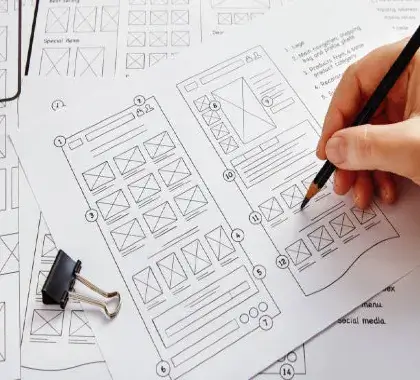
The landscape of digital product design is evolving at a breakneck pace. Gone are the days when UX/UI designers spent endless hours manually resizing components, generating dummy text, or creating repetitive layout grids. Today, the intersection of artificial intelligence and design engineering has unlocked a new paradigm: AI-assisted workflows.
For modern designers, mastering AI strategy isn’t about letting an algorithm take over your creative vision. Instead, it is about learning how to orchestrate AI tools within your primary canvas—Figma—to eliminate grunt work, build smarter prototypes, and scale your design systems effortlessly.
Why AI Strategy Matters in Modern UX/UI
An effective AI strategy means transitioning from a purely manual creator to a creative director. When you integrate artificial intelligence into your product design workflow, you achieve two massive advantages:
- Accelerated Ideation: Turning wireframes or text prompts into functional UI layouts in seconds.
- Data-Driven UX: Using AI to predict user behavior patterns and visual hierarchy before writing a single line of code.
By leveraging Figma’s native capabilities alongside powerful third-party AI plugins, you can transform your design execution speed by up to 10x.
Step-by-Step Guide to Implementing AI inside Figma
1. Smart Wireframing and Layout Generation
Instead of starting from a blank canvas, use generative AI plugins like Wireframe Designer or Musho AI directly inside Figma. By typing a simple, strategic prompt—such as “Create a clean, grid-based dashboard for a video editing studio”—AI can instantly generate organized auto-layout frames. This gives you an immediate structural blueprint that you can instantly customize according to your unique branding rules.
2. Automating UX Content with Real-World Context
Say goodbye to boring “Lorem Ipsum” text. Modern UX design requires contextual copy to test actual user readability. Using AI tools like Writer or Relume within Figma, you can instantly populate your UI components with highly accurate, localized, and tone-specific microcopy. Whether you need error messages, product descriptions, or engaging call-to-action buttons, AI handles it dynamically while you focus on the visual hierarchy.
3. Predicting Usability with Visual Attention Maps
A crucial part of any UX strategy is testing. Before presenting your Figma high-fidelity prototypes to stakeholders, deploy predictive AI plugins like Attention Insight. These tools use deep learning algorithms to generate instant heatmap analyses of your layouts. It reveals exactly where a user’s eyes will look first, allowing you to optimize your CTA placements and header text placement based on scientific data.
Best Practices for Designers: Balancing AI with Human Touch
While AI is incredibly powerful at generating variations and structured grids, it lacks human empathy, cultural context, and deep visual storytelling capabilities. To stay ahead as a modern designer, use this simple formula:
- Let AI handle the structure: Use it for automated spacing, placeholder populating, code-snippet generation, and basic components.
- Keep the core strategy human: Infuse your own unique brand vision, structural storytelling, and user-centric problem-solving into the final design layer.
Conclusion
Integrating an AI strategy within Figma is no longer a futuristic concept—it is a vital skill for the modern UX/UI ecosystem. By automating tedious setup processes, you free up your mental bandwidth to focus on what truly matters: creating deeply engaging digital product experiences and building unique visual narratives. Embrace AI as your ultimate collaborative assistant, and watch your product design workflow scale like never before.
Frequently Ask Questation
AI can automate repetitive tasks such as generating layouts, creating wireframes, organizing design components, suggesting content, and speeding up prototyping. This allows designers to focus more on user research, creativity, and problem-solving.
No. AI is a powerful assistant, not a replacement. While AI can automate routine design tasks, human designers are still needed for empathy, user research, strategic thinking, accessibility, and the creation of meaningful user experiences.
AI speeds up ideation and testing by enabling designers to quickly create multiple design variations. Instead of spending hours on manual adjustments, designers can test several concepts, gather feedback faster, and improve the user experience more efficiently.
Overusing AI can lead to generic designs, reduced creativity, and experiences that lack emotional connection. The best approach is to use AI for efficiency while applying human-centered design principles to ensure the final product remains unique, accessible, and user-focused.