UI Designer Jobs

Responsive Design In Figma, digitalanivipractice

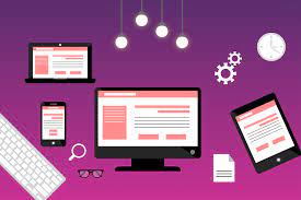
In this article, I am going to tell you UI (User Interface) designer jobs are in demand across various industries. As businesses increasingly prioritize creating engaging and user-friendly digital experiences. UI Designer Jobs. Here are some common UI designer job roles and responsibilities:

UI Designer:

Responsible for designing the visual elements of a digital product, including layout, typography, color schemes, and interactive elements. They collaborate with UX designers and developers to create visually appealing and functional interfaces.

Web Designer:

Focuses on designing websites and web applications, ensuring that they are visually appealing, easy to navigate, and aligned with brand guidelines. Web designers may also have skills in HTML, CSS, and JavaScript to implement their designs.

Mobile App Designer:

Specializes in designing interfaces for mobile applications, considering factors such as screen size, touch interactions, and platform-specific design guidelines (e.g., iOS Human Interface Guidelines, Material Design for Android).

Product Designer:

Works on end-to-end product design, from concept ideation to final implementation. Product designers collaborate with cross-functional teams to understand user needs, define design requirements, and create intuitive interfaces that meet user goals.

UI/UX Designer:

Combines skills in both UI and UX design to create seamless and user-centered digital experiences. UI/UX designers focus on understanding user needs, conducting user research, and translating insights into visually appealing and functional interfaces.

Visual Designer:

Focuses on creating visually engaging designs that communicate brand identity and messaging effectively. Visual designers may work on a variety of projects, including websites, mobile apps, marketing materials, and branding collateral.

Interaction Designer:

Specializes in designing interactive elements and animations that enhance user engagement and usability. Interaction designers focus on creating intuitive and responsive interfaces that guide users through the digital experience.

UI Design Lead/Manager:

Oversees a team of UI designers, providing guidance, mentorship, and direction on design projects. UI design leads are responsible for setting design standards, ensuring consistency across projects, and driving innovation in UI design practices.

Skill Requirements:

Employers often look for UI designers with proficiency in design software such as Adobe XD, Sketch, Figma, or Adobe Photoshop. Additionally, knowledge of front-end development technologies like HTML, CSS, and JavaScript may be beneficial, especially for roles that involve prototyping or collaborating closely with developers.

Industry Specializations:

UI designer roles can vary based on the industry or type of organization. For example, UI designers in the tech industry may focus on designing digital products such as software applications or SaaS platforms, while those in the e-commerce industry may work on optimizing user interfaces for online shopping experiences.

Collaboration and Communication:

User Interface (UI) designers play a critical role in the development of digital products and interfaces. They work closely with cross-functional teams, which may include UX designers, software developers, product managers, and stakeholders. The goal of this collaboration is to ensure that the end product is not only visually appealing but also intuitive and user-friendly. Through their expertise in design principles, UI designers help to create engaging digital experiences that meet the needs and expectations of users. Strong communication and collaboration skills are essential for effectively communicating design ideas, gathering feedback, and aligning with project goals and objectives.

Portfolio Development:

Building a strong portfolio showcasing your design skills and relevant projects is crucial for landing UI designer roles. Your portfolio should demonstrate your ability to create visually appealing and user-centric interfaces, as well as highlight your design process, problem-solving skills, and attention to detail.

Continuous Learning:

The field of UI design is constantly evolving, with new tools, trends, and technologies emerging regularly. Staying updated on industry trends, attending design conferences or workshops, and participating in online courses or communities can help UI designers stay competitive and enhance their skills.

Soft Skills:

In addition to technical skills, employers often value soft skills such as creativity, adaptability, problem-solving, and attention to detail in UI designers. These skills contribute to effective design thinking and the ability to deliver innovative and user-friendly solutions.

Remote Work Opportunities:

With the rise of remote work, many UI designer roles offer opportunities for remote or flexible work arrangements. Be sure to consider your preferences for remote work versus in-person collaboration when exploring job opportunities.

User-Centered Design (UCD) Principles:

Employers often seek UI designers who have a strong understanding of user-centered design principles. This includes conducting user research, creating user personas, and incorporating user feedback into the design process to create intuitive and user-friendly interfaces.

Prototyping and Wireframing:

Proficiency in prototyping and wireframing tools such as InVision, Axure RP, or Adobe XD is commonly required for UI designer roles. Being able to quickly create interactive prototypes allows designers to validate design concepts and gather feedback early in the design process.

To find UI designer jobs, individuals can search on job boards, company websites, and professional networking platforms such as LinkedIn. Additionally, building a strong portfolio showcasing relevant design projects and skills can help UI designers stand out to potential employers.

By considering these factors and tailoring your job search and skill development accordingly, you can pursue rewarding UI designer roles that align with your interests, strengths, and career goals. UI Designer Jobs
The objective of user research is

Low Fidelity Wireframes Figma digitalanovipracticeb

The objective of user research is to gain a deep understanding of the target users, their needs, preferences, behaviors, and pain points. This understanding helps inform the design and development process by ensuring that products and services are tailored to meet the needs and expectations of the users.

Specifically, the objectives of user research include:

Identifying User Needs:

User research helps uncover the specific needs and requirements of the target users. By understanding what users are trying to accomplish and the challenges they face, designers can create solutions that address these needs effectively.

Informing Design Decisions:

User research provides valuable insights that inform design decisions throughout the product development lifecycle. By understanding user behaviors and preferences, designers can make informed choices about features, functionality, and user interface design.

Validating Assumptions:

User research helps validate assumptions and hypotheses about user behavior and preferences. By testing ideas with real users, designers can confirm whether their assumptions are accurate and make adjustments as needed.

Improving Usability:

User research helps identify usability issues and areas for improvement in existing products or prototypes. By observing how users interact with a product, designers can identify pain points and friction points in the user experience and make iterative improvements.

Enhancing User Satisfaction:

Ultimately, the objective of user research is to create products and services that meet the needs of users and provide a positive user experience. By incorporating user feedback and insights into the design process, designers can create solutions that are intuitive, enjoyable, and satisfying to use.

Understanding User Context:

User research aims to understand the context in which users interact with products or services. This includes factors such as the user’s environment, goals, motivations, and constraints. By understanding the context, designers can create solutions that are relevant and meaningful to users’ lives.

Identifying Opportunities:

User research helps identify opportunities for innovation and improvement. By uncovering unmet needs or pain points, designers can identify areas where new products or features could provide value to users.

Mitigating Risks:

User research can help mitigate risks associated with product development by identifying potential usability issues or user acceptance barriers early in the process. By addressing these issues proactively, designers can reduce the likelihood of costly rework or product failures.

Gaining Stakeholder Buy-In:

User research can help gain buy-in from stakeholders by providing evidence-based insights into user needs and preferences. By involving stakeholders in the research process and sharing findings with them, designers can build consensus around design decisions and priorities.

Iterative Improvement:

User research supports an iterative approach to design, where solutions are continuously refined based on user feedback and testing. By conducting ongoing research throughout the design process, designers can ensure that products evolve to meet changing user needs and market conditions.

Building Empathy:

User research helps designers develop empathy for their users by understanding their perspectives, challenges, and goals. By empathizing with users, designers can create more human-centered solutions that resonate with users on an emotional level.

Measuring Success:

User research helps define success metrics and KPIs (Key Performance Indicators) for design projects. By measuring the impact of design changes on user behavior and outcomes, designers can assess the effectiveness of their solutions and make data-driven decisions.

Optimizing Conversion:

User research aims to understand the factors that influence user behavior and decision-making, to optimize conversion rates. By identifying barriers to conversion and opportunities for improvement, designers can create more effective user journeys and call to action.

Increasing Engagement:

User research helps designers understand what motivates users to engage with products or services and how to sustain their interest over time. By identifying features and content that resonate with users, designers can create more engaging and compelling experiences.

Ensuring Accessibility:

User research includes accessibility considerations, ensuring that products and services are usable by individuals with disabilities. By understanding the needs of diverse user groups, designers can create inclusive designs that accommodate a wide range of users.

Supporting Personalization:

User research helps designers understand user preferences and behaviors, enabling them to tailor experiences to individual users’ needs and interests. By incorporating personalization features, designers can create more relevant and personalized experiences that drive user satisfaction and loyalty.

Fostering Brand Loyalty:

User research contributes to building strong relationships between users and brands by creating experiences that resonate with users on an emotional level. By understanding the values and aspirations of their target audience, designers can create brand experiences that foster loyalty and advocacy.

Adapting to Market Trends:

User research helps designers stay informed about market trends, industry best practices, and emerging technologies. By staying abreast of changes in user behavior and preferences, designers can adapt their designs to remain competitive and relevant in the marketplace.

Informing Business Strategy:

User research provides valuable insights that inform strategic decision-making within organizations. By understanding user needs and market dynamics, designers can help shape product roadmaps, marketing strategies, and business priorities to better serve their target audience.

Driving Innovation:

User research fosters a culture of innovation by encouraging designers to explore new ideas, experiment with different approaches, and challenge existing assumptions. By embracing a user-centric mindset, designers can drive innovation that leads to breakthrough products and experiences. The objective of user research is

By incorporating these additional objectives into their user research efforts, designers can create more impactful and meaningful experiences for users while driving business success and competitive advantage.

Card Sorting in UX

What is an iOS application. digitalanivipracticeb

Customer journey maps in UX are visual representations that outline. The steps and experiences a customer undergoes. When interacting with a product, service, or brand. They detail the customer’s journey from initial awareness through to post-purchase support, highlighting touchpoints and emotions along the way. Their importance lies in providing a deep understanding of the customer experience, identifying pain points, and opportunities for improvement, ultimately leading to enhanced customer satisfaction and loyalty.

Documentation and Communication:

The results of card-sorting exercises should be documented and communicated effectively to stakeholders and team members. Visual representations such as affinity diagrams or heatmaps can help convey insights clearly and concisely.

Card sorting proves beneficial when you aim to:

Develop a new mobile app or a section within an existing one.

Understand how your customers anticipate information grouping within your app.

Explore and contrast various perceptions of different concepts or ideas.

Engage participants in ranking or arranging items based on specific criteria.

Refine Navigation:

Determine the most intuitive navigation structure for your app by allowing users to organize content into categories and subcategories.

Optimize Information Architecture: Identify opportunities to streamline and improve the organization of content within your app to enhance user discoverability and accessibility.

Validate Design Decisions: Test hypotheses and validate design choices by observing how users naturally group and categorize information, ensuring that your app’s structure aligns with user expectations.

Enhance User Engagement: By involving users in the organization process, you can increase their sense of ownership and engagement with your app, leading to a more positive user experience.

Utilize card sorting to categorize and prioritize content effectively. By grouping similar content through this method, you can devise logical menus that align with user expectations and preferences.

Organize Content: Card sorting allows you to organize content into logical groups based on similarities and themes. This helps in creating a coherent structure for your menus and navigation systems.

Prioritize Information: In addition to categorizing content, card sorting also helps in determining the priority of different pieces of information. By observing how users arrange and prioritize cards, you can identify which content is most important or relevant to them.

Iterative Process:

Card sorting is often an iterative process, meaning you can conduct multiple rounds of sorting to refine and optimize the organization of your content. This iterative approach allows for continuous improvement based on user feedback.

User-Centered Design: By involving users in the sorting process, you ensure that the final menu structure reflects their mental models and preferences. This user-centered approach leads to more intuitive and user-friendly navigation experiences.

Facilitate Navigation: Through card sorting, you can streamline navigation pathways by grouping related content. This guarantees that customers can without difficulty locate the records they need, improving their common surfing experience.

Reduce Cognitive Load: By organizing content into logical menus, you reduce the cognitive load on users as they navigate your app. Clear and intuitive menu structures make it easier for users to understand where to find specific information, leading to faster task completion.

Enhance User Satisfaction: When users can quickly and effortlessly access the content they’re looking for, it contributes to a positive user experience. This, in turn, can lead to increased satisfaction and loyalty towards your app.

Inform Design Decisions:

The insights gathered from card sorting exercises can inform various design decisions, such as menu layout, labeling, and information hierarchy. These decisions are grounded in user preferences and behaviors, making them more likely to resonate with your target audience.

Overall, card sorting serves as a valuable tool in UX design, helping to create organized, user-friendly, and intuitive menu structures that enhance the overall usability of your app. Card Sorting in UX

Tree testing is similar to Card Sorting

UX Card Sorting 2024. digitalanivipracticeb

Tree testing

Tree testing, also known as reverse card sorting or card-based classification testing, is a usability testing method used in UX research to evaluate the navigational structure of a website or application. In tree testing, participants are presented with a hierarchical structure of the website’s content, typically represented as a text-based outline or tree diagram.

Tree Testing:

  • In tree testing, participants are presented with a pre-defined hierarchical structure of the website’s content, typically represented as a text-based outline or tree diagram.
  • Participants are asked to complete specific tasks by navigating through the hierarchical structure to find the information they need.
  • The focus of tree testing is on evaluating the effectiveness of the existing navigational structure in helping users locate information quickly and easily.
  • Tree testing assesses the findability and usability of the navigational structure, helping identify areas for improvement in the organization and labeling of content.
  • Tree testing is often used in conjunction with card sorting. In tree testing, participants are given a hierarchical menu structure (without labels) and asked to find specific items or complete tasks. This helps validate the effectiveness of the information architecture developed through card sorting.

Card Sorting

UX card sorting” is the process of creating a user interface (UX) by organizing. Labeling information into groups on physical or digital cards. This method helps designers and researchers understand. How users categorize and prioritize information, which can inform. The layout of an extra intuitive and user-pleasant interface.

Card Sorting:

  • In card sorting, participants are given a set of content items (represented as cards) and asked to group them into categories or topics that make sense to them.
  • Participants can create their own categories and label them based on their understanding of the content.
  • The focus of card sorting is on understanding how users mentally organize and categorize information, providing insights into the user’s mental model of the content.
  • Card sorting helps inform the design of the navigational structure by identifying user-generated categories and labels that align with users’ mental models.

Types of card sorting:

Open Card Sorting:

Participants actively organize cards into groups and labels. Those groups themselves, without the researcher. Providing any predefined categories. This method provides insight into users’ natural mental models. How they perceive relationships between items.

Closed Card Sorting:

Participants are given predefined categories and asked to sort the cards into these categories. This method is useful for validating existing information architectures or navigation structures and assessing. Whether users understand and agree with the predefined categories.

Remote Card Sorting:

With the advent of online tools and remote research methodologies. Card sorting can also be conducted remotely. Participants can sort cards virtually using specialized software or online platforms. Allowing for a broader reach of participants and flexibility in research methods.

Analysis Techniques:

After the card sorting exercise, designers analyze. The results identify common patterns, groupings, and discrepancies among participants. This analysis helps inform decisions about information architecture, content organization, and navigation design.

Iterative Process:

Card sorting is often conducted iteratively throughout the design process to validate and refine. Information architectures and navigation structures. Designers may conduct multiple rounds of card sorting with different participant groups to gather diverse perspectives and insights.

Combining Methods:

Card sorting is frequently combined with other UX research methods. Such as user interviews, usability testing, and analytics analysis. To gain a comprehensive understanding of users’ needs, behaviors, and preferences.

Inclusive Design:

When conducting card sorting exercises. It’s important to include diverse participants who represent the target audience. To ensure that the resulting information architecture and navigation structure are inclusive and accessible to all users.

Real-World Applications:

Card sorting can be applied to various design challenges. Including website redesigns, and mobile app development. Content organization for intranets or knowledge bases, and product feature prioritization.

Hybrid Card Sorting:

Some researchers use a hybrid approach, combining elements of open and closed card sorting. For example, participants might be given some predefined categories. But also have the flexibility to create additional categories if needed.

Reverse Card Sorting:

In reverse card sorting, participants are given a set of categories and asked to suggest items. That belongs in each category. This approach can help validate existing categories or generate new ones based on user input.

Conclusion

In summary, while both tree testing and card sorting are usability testing methods used to evaluate the navigational structure of a website or application, tree testing focuses on evaluating the effectiveness of the existing navigational structure, while card sorting helps inform the design of the navigational structure by understanding users’ mental models of the content.

“Customer journey maps in UX

How To Learn UX Design, digitalanivipracticeb

Customer journey maps in UX, and why are they important?”

Customer Journey Maps are visual representations of the steps and experiences. That a customer goes through when interacting with a product, service, or brand. These maps document the customer’s journey from initial awareness and consideration. To the final purchase and beyond, including post-purchase support and loyalty. They are used to understand and analyze the customer experience, identify pain points and opportunities for improvement, and align. Internal teams around a common understanding of the customer’s needs and goals.

It matters because it provides valuable insights into the customer’s perspective. Helping businesses empathize with their customers and design better experiences. Here are some reasons why Customer Journey Maps are important:

Understanding the Customer Experience:

Customer Journey Maps allow businesses to gain a holistic understanding of the customer experience. By mapping out every touchpoint and interaction across various channels and stages of the journey.

Identifying Pain Points:

By visualizing the customer journey, businesses can identify pain points and areas of friction. That may negatively impact the customer experience. This insight enables them to prioritize improvements and address issues that may be hindering customer satisfaction.

Improving Customer Satisfaction:

Customer Journey Maps help businesses identify opportunities to enhance the customer experience, leading to increased satisfaction, loyalty, and retention.

Aligning Internal Teams:

Customer Journey Maps serve as a shared reference point for cross-functional teams, aligning everyone around a common understanding of the customer’s needs and goals. This alignment fosters collaboration and ensures that efforts are focused on delivering a consistent and cohesive experience.

Driving Innovation:

By uncovering gaps and opportunities in the customer journey, businesses can identify areas for innovation and differentiation. Customer Journey Maps inspire new ideas and initiatives that can help businesses stay ahead of the competition and meet evolving customer expectations.

Measuring and Tracking Progress:

This provides a baseline for measuring and tracking improvements in the customer experience over time. Businesses can use metrics and feedback to evaluate the effectiveness of their initiatives and make data-driven decisions to continuously optimize the customer journey.

Identify Opportunities for Differentiation:

This highlights opportunities for differentiation by identifying unique touchpoints or experiences that can set a business apart from competitors and create memorable moments for customers.

Support Decision-Making:

They provide valuable insights that support decision-making across various departments, including marketing, product development, customer service, and sales, ensuring that initiatives are aligned with the overall customer experience strategy.

Empower Continuous Improvement:

This empowers organizations to continuously monitor, evaluate, and improve the customer experience by identifying areas for optimization and innovation, driving ongoing growth and success.

Overall, Customer Journey Maps are valuable tools for businesses seeking to better understand their customers, improve the customer experience, and drive business growth. By putting the customer at the center of their strategy, businesses can create more meaningful and memorable experiences that build long-lasting relationships and drive sustainable success. By leveraging Customer Journey Maps effectively, businesses can gain a competitive edge, foster customer loyalty, and drive sustainable growth by delivering exceptional experiences that meet and exceed customer expectations at every stage of their journey. Customer journey maps are valuable tools for businesses seeking to better understand their customers, identify pain points, and create more seamless and enjoyable experiences that drive customer satisfaction and loyalty. They provide a visual framework for analyzing and optimizing the customer journey, ultimately leading to improved business outcomes and growth. “What are customer journey maps in UX, and why are they important?”

“Describe Video Cuts 2024.”

“Describe Video Cuts 2024.”

Standard Video Cut

A standard video cut is a simple editing technique where one shot is replaced by another shot in a direct manner. Creating a straightforward transition between scenes or perspectives in a video.

A standard video cut is a fundamental editing technique used in filmmaking and video production. It involves transitioning from one shot to another by replacing the current shot with the next one. This type of cut is straightforward and seamless. Providing a natural flow between scenes or perspectives in the video.

A standard video cut is the most common and straightforward editing technique used in filmmaking and video production. It involves transitioning from one shot to another by simply replacing the current shot with the next one. This type of cut is effective in maintaining continuity and creating a smooth flow between scenes or perspectives in the video.

Jump Cuts

A jump cut is an abrupt transition between two shots of the same subject. Where the camera angle, framing, or position changes slightly, creating a discontinuity in the visual flow. It typically occurs within the same scene or sequence. Giving the impression of a sudden jump forward in time or space. Jump cuts are often used for stylistic purposes, to convey a sense of urgency, or to compress time in a montage sequence. While they can add dynamism to a scene, jump cuts can also be disorienting if not used thoughtfully.

Jump cuts are characterized by their abrupt transition between two shots of the same subject. Where there is a noticeable change in the framing, angle, or position of the camera. This editing technique creates a visual discontinuity and can give the impression of a sudden leap. Forward in time or space within the same scene. Jump cuts are often used for stylistic effects. To convey a sense of urgency, or to compress time in a montage sequence. However, they can also be disorienting to viewers if not executed thoughtfully.

Cross Cuts

A Cross-cut, also known as parallel editing. A film editing technique that involves alternating between two or more separate scenes. Storylines that are happening simultaneously but in different locations. This editing technique allows filmmakers to show multiple events unfolding concurrently, building tension, suspense, or juxtaposition between the different narratives. Cross-cuts are commonly used to create a sense of urgency, illustrate cause-and-effect relationships, or provide context by showing different perspectives of the same event. They are a powerful storytelling tool that adds complexity and depth to a film’s narrative structure.

Match Cut

A match cut is a film editing technique where a transition occurs between two shots that share a visual or audio similarity. This type of cut is often used to create a seamless and smooth transition between scenes or to establish a thematic connection between two different elements in the film. Match cuts can be based on visual elements such as shape, color, or movement, as well as auditory elements such as sound effects or dialogue. They are effective in enhancing continuity, rhythm, and cohesion in the storytelling process, providing viewers with a sense of coherence and unity within the film.

A video cut refers to a transition in a video where one shot is replaced by another shot. This basic editing technique is used to change scenes, viewpoints, or perspectives within a video. Video cuts can vary in style and intensity, ranging from seamless and unnoticeable transitions to abrupt and jarring changes between shots. They are fundamental to the editing process and play a crucial role in shaping the pacing, rhythm, and narrative flow of a video production. “Describe Video Cuts 2024.”

20 different types of video cuts

How To Stabilize Video In Premiere Pro digitalanivipractice

20 different types of video cuts. Video cuts, also known as movie cuts or film cuts, are transitions utilized in films and videos to seamlessly integrate various camera shots.

1. Standard Cut:

Transition from one shot to another, typically used for continuity. The standard cut, also known as “Shot-Reverse Shot,” is a familiar and widely used editing technique. It’s a fundamental cut employed in numerous films and productions, seamlessly transitioning between different shots to maintain continuity and convey the conversation or action between characters.

2. Jump Cut:

The abrupt transition among photographs of equal subjects has a jarring effect. Jump cuts derive their name from their characteristic leap forward or backward in a film’s timeline, signifying the passage of time. One notable instance of jump cuts is famously found in Jean-Luc Godard’s debut film “Breathless.”

3. Cross Cut:

Alternating between two separate scenes happening simultaneously. Cross-cut edits offer an effective method to intertwine multiple narratives simultaneously, allowing for a dynamic storytelling approach.

4. Match Cut:

Transition between two shots that share a visual or audio similarity. A match cut serves as an editing technique that provides context and maintains continuity within a scene.

5. L Cut (Split Edit):

Audio from the preceding shot continues into the following shot before the video cuts. “These editing styles prioritize fluidity,” explains editor Cody Liesinger. “When editing is overly conspicuous, it can disrupt the narrative’s flow, resulting in a disjointed viewing experience.”

6. J Cut (Split Edit):

Audio from the following shot is heard before the video cuts to that shot. The J cut serves as the inverse of the L cut.

7. Fade In/Fade Out:

Gradual increase or decrease in the visibility or audibility of a shot. A visual effect is employed to signify a shift in both location and time.

8. Dissolve:

The Transition between two shots by gradually blending them.

9. Wipe:

One shot replaces another by moving across the screen to reveal the new shot. A wipe transition involves an animation, often digital, that smoothly “wipes” the preceding scene off the screen to reveal the subsequent scene.

10. Swipe:

Similar to a wipe but with a vertical or horizontal motion. A simple technique to seamlessly connect two distinct shots is by smoothly panning out from the first shot and then panning back into the second shot.

11. Iris In/Iris Out:

A circular or oval mask expands or contracts to reveal or conceal the shot. In the iris transition, the film camera gradually closes or opens its aperture, resulting in the visible image on the film shrinking or expanding within a circular frame, bordered by black.

12. Flip:

The transition where one shot flips to reveal the next shot. The process involves generating a mirrored reflection of the original footage.

13. Zoom:

Transition where the camera zooms in or out to change the shot.

14. Slide:

The transition is where one shot slides off-screen to reveal the next shot.

15. Luma Key:

Transition based on the luminance (brightness) values of the shots. This technique is primarily beneficial for static images, such as logos against a black backdrop, or digitally created graphics.

16. Morph Cut:

Seamless transition between two shots, often used for removing jump cuts. A morph cut offers a more efficient method for removing video frames during editing.

17. Stencil:

The transition where one shot is revealed through a stencil-shaped mask.

18. Ghosting:

The transition where the previous shot remains visible as a faint overlay while transitioning to the next shot.

19. Pixelation:

The transition where one shot pixelates or blurs to reveal the next shot.

20. Whip Pan:

Rapid horizontal or vertical movement of the camera to transition between shots.

Video cuts refer to the editing technique of transitioning from one video clip to another, typically to change scenes, viewpoints, or perspectives in a video production. 20 different types of video cuts

7 essential UX design principles 2024

Low Fidelity Wireframes Figma digitalanovipracticeb

7 essential UX design principles 2024. Mastering the art of user experience (UX) design involves adhering to fundamental principles that prioritize the needs and preferences of users. These principles guide designers in creating products and services that effectively address user problems while ensuring ease of use and enjoyment.

Here are seven essential UX design principles that every designer should be familiar with:

User-Centered Design:

Focus on understanding the needs, goals, and behaviors of users throughout the design process. By placing users at the center of decision-making, designers can create solutions that resonate with their intended audience. It’s an integral part of the UX process, beginning with thorough user research to pinpoint the problem to be addressed and to gain insight into the target audience. This commitment to user-centricity continues through the design process, culminating in user testing to evaluate how effectively the product aligns with user needs.

When embarking on a new UX project. It’s essential to uphold the principle of user-centricity, ensuring that every decision made is in the best interest of the users. While also considering the objectives of the business. Striking a balance between user needs and business goals is key to creating a successful and impactful user experience.

Consistency:

Maintain consistency in design elements such as layout, navigation, terminology, and visual style across all aspects of the product or service. Consistency helps users develop familiarity with the interface and enhances usability.

Consistency in design also involves meeting the user’s expectations regarding the type of product being developed. For instance, if you’re designing a flight booking app. Users will have preconceived notions about how such apps typically function. Based on their past experiences with similar applications. While it’s not necessary to mimic competitors’ designs. There’s value in adhering to established conventions.

By aligning with user expectations, you ensure that your product is intuitive and easy to use. Minimizing the learning curve for users. This approach is crucial for delivering a seamless user experience that fosters user satisfaction and engagement.

Accessibility:

Ensure that the product or service is accessible to users of all abilities, including those with disabilities. Design with accessibility in mind by providing alternatives for content consumption, clear navigation paths, and compatibility with assistive technologies. An instance of designing for accessibility involves employing high color contrast to guarantee that text remains legible for users with visual impairments. To witness accessible design principles in action, explore the following websites that have effectively implemented accessibility features.


Hierarchy:

Hierarchy is a fundamental UX design principle that significantly influences. The user’s navigation experience within a product determines its ease or complexity. It encompasses both information architecture and the visual hierarchy of individual pages or screens. In essence, hierarchy dictates the prominence and accessibility of various elements within the product.

Information architecture pertains to the broader structure and organization of the website or app, represented by its sitemap. It outlines how users navigate between pages or screens and ensures logical flow and organization throughout the product. On the other hand, visual hierarchy focuses on the arrangement and presentation of elements within specific pages or screens. It emphasizes making important elements more prominent and easier to find, guiding users’ attention and interaction effectively.

Feedback and Response:

Provide timely and relevant feedback to users to acknowledge their actions and guide them through the interface. Incorporate visual cues, animations, and notifications to keep users informed about system status and interactions.

Flexibility and Control:

Empower users with flexibility and control over their interactions by offering customizable settings, preferences, and options. Allow users to tailor the experience to their preferences and adjust settings according to their needs.

Iterative Improvement:

Embrace an iterative layout system that includes non-stop testing, feedback, and refinement. Iterate designs based on user insights, usability testing, and analytics to identify and address usability issues and enhance the overall user experience.

By adhering to these fundamental UX design principles, designers can create products and services that are intuitive, engaging, and effective in meeting user needs. Keeping these principles in mind throughout the design process ensures that the final product delivers a superior user experience and drives user satisfaction and loyalty. 7 essential UX design principles 2024

UX Laws 2024

How To Learn UX Design, digitalanivipracticeb

In UX design, “UX laws 2024” are principles, guidelines, or heuristics that serve as fundamental rules to follow when designing user interfaces and experiences. These laws are derived from research, observations, and best practices in the field of user experience design. While they are not strict laws in a legal sense, they are widely accepted as foundational principles that help designers create effective and user-friendly interfaces. Some common UX laws include:

Hick’s Law:

This law states that the time it takes for a person to make a decision increases with the number of options available. Designers use this principle to simplify choices and reduce cognitive overload for users. To reduce decision time during critical response times, limit the number of choices available. However, avoid oversimplification that leads to abstraction. Instead, break down complex tasks into smaller, more manageable steps to lessen cognitive load. Employ progressive onboarding techniques to ease the cognitive burden for new users.

Fitts’s Law:

Fitts’s Law states that the time required to transport to a goal region is a feature of the space to the goal and the dimensions of the goal. Designers apply this law to optimize the placement and size of interactive elements, such as buttons and links, to make them easier to click or tap.

The primary implication of Fitts’s law is straightforward: increase target size. According to Fitts’s law, users will execute clicks, taps, or hovers more quickly on larger targets. Moreover, error rates decrease as target sizes increase. Typically, guidelines for target size are established by analyzing error rates across different target sizes and identifying the point at which the error rate stabilizes.

Miller’s Law:

Miller’s Law suggests that the average person can only keep seven (plus or minus two) items in their working memory at once. Designers consider this limitation when organizing information and content to avoid overwhelming users with too much information at once.

Jakob’s Law:

Jakob’s Law states that users are more comfortable and prefer interfaces that are familiar to them. Designers leverage this principle by adhering to established design patterns and conventions to create intuitive and user-friendly interfaces.

Utilizing established mental models allows for the creation of enhanced user experiences, enabling users to concentrate on their tasks rather than learning new models.

Gestalt Principles:

Gestalt principles are a set of laws that describe how humans perceive visual elements as organized wholes. These principles include proximity, similarity, closure, continuity, and figure-ground. Designers use Gestalt principles to create layouts and visual hierarchies that facilitate understanding and comprehension.

Zeigarnik Effect:

The Zeigarnik Effect suggests that people remember incomplete or interrupted tasks better than completed ones. Designers apply this principle by using progress indicators or saving user input automatically to encourage engagement and completion of tasks.

Peak-End Rule:

The Peak-End Rule states that people judge experiences based on the most intense point (the peak) and the end of the experience. Designers focus on creating memorable peaks and positive endings in user interactions to leave a lasting impression.

These are just a few examples of UX laws that guide designers in creating better user experiences. While not absolute rules, they provide valuable insights and guidelines for designing interfaces that are intuitive, efficient, and enjoyable for users. UX Laws 2024

Final Cut & Export and Delivery Phase of Video Editing

post-production digitalaivipractice

5th Phase of Video Editing: Final Cut

The final cut stage of video editing is the last step in the editing process. Final Cut & Export and Delivery Phase of Video Editing. Before the video is considered complete and ready for distribution. Here’s what happens during this stage:
Polishing Visuals and Audio:

During the final cut, the editor focuses on fine-tuning every aspect of the video to achieve the desired level of quality. This includes polishing visual elements such as color grading, and exposure adjustment. Image stabilization, as well as refining audio elements such as sound levels, clarity, and balance.

Refinement of Transitions and Effects:

Any remaining transitions and effects are refined to ensure smoothness and consistency throughout the video. This may involve adjusting the timing and duration of transitions, fine-tuning visual effects, and ensuring that all elements complement each other seamlessly.

Integration of Graphics and Titles:

Graphics, text overlays, and titles are integrated into the video. To provide context, convey information, and enhance the overall storytelling. The placement, design, and timing of these elements are carefully considered to ensure they add value without distracting from the main content.

Review and Approval:

The final cut is reviewed by the editor and any relevant stakeholders. Such as clients or collaborators, to ensure that it meets the desired vision and objectives. Feedback is carefully considered, and any necessary revisions or adjustments are made to address concerns and ensure satisfaction.

Quality Assurance:

A thorough quality assurance check is conducted to identify and rectify . Any technical issues, errors, or inconsistencies in the video. This includes checking for audio and visual glitches. Ensuring proper formatting and compression settings, and verifying the overall integrity of the final product.

Export and Delivery:

Once the final cut is approved and all quality checks are complete. The video is exported in the desired format and resolution for distribution. The editor ensures that the video is optimized for playback on various platforms and devices. Delivers the finished product to the client or audience.

the final cut stage represents the culmination of the editing process, where all elements of the video come together to create a polished and professional end product. It marks the completion of the editor’s creative vision and efforts and prepares the video for its final release to the world.

6th Phase of Video Editing: Export and Delivery

Exporting and delivery is the final stage of the video editing process, where the completed video is prepared for distribution to the intended audience. Here’s what happens during this stage:
Selecting Export Settings:

The editor selects the appropriate export settings based on the intended distribution platform, audience preferences, and technical specifications. This includes choosing the file format, resolution, frame rate, codec, and other settings to ensure optimal playback quality.

Rendering the Video:

Once the export settings are selected, the video editing software renders the final video file. This process involves encoding the video and audio data according to the chosen settings, compressing the file size if necessary, and generating a playable video file.

Quality Assurance:

Before finalizing the export, the editor conducts a final quality assurance check to ensure that the video meets the desired standards of quality and consistency. This may involve reviewing the video for any technical issues, visual or audio glitches, or formatting errors that need to be corrected.

Exporting the Video:

Once the quality assurance check is complete, the editor initiates the export process to generate the final video file. Depending on the size and complexity of the video, this process may take some time to complete.

Delivery to Client or Audience:

Once the video export is finished, the final video file is delivered to the client, stakeholders, or intended audience through the appropriate channels. This may involve uploading the video to a video hosting platform, sharing it via email or cloud storage, or distributing it through other means.

Optimizing for Playback:

Before distributing the video, the editor ensures that it is optimized for playback on various devices and platforms. This may involve creating different versions of the video optimized for web, mobile, or social media platforms, and ensuring compatibility with different operating systems and browsers.

Documentation and Archiving:

Finally, the editor documents the export settings and any relevant information about the video for future reference. This includes keeping records of the export settings used, any special instructions or requirements from the client, and any feedback received during the delivery process.

Overall, the export and delivery stage ensures that the completed video is packaged and delivered in a format that meets the needs and expectations of the client or audience. It marks the final step in the video editing process and prepares the video for its release to the world. Final Cut & Export and Delivery Phase of Video Editing

Optimized with PageSpeed Ninja