Visual Hierarchy In UI Design
In UI design, visual hierarchy places and presents elements to indicate their importance. Allowing effective user navigation through the interface. Designers can control the sequence in which users notice and understand the information displayed on the screen by manipulating the size, color, contrast, alignment, spacing, and other visual elements.
Importance of Visual Hierarchy in UI Design:
- It Gives a Direction: The first thing visual hierarchy does is hold the user’s attention at the most crucial parts of the interface. Helping them pay attention to important information or move in a desired direction.
- User Friendly: Good visual hierarchy allows an interface to be easily navigated. And thus it improves the overall user experience. This makes it possible for users to get what they want without wasting much time.
- Fosters Comprehension: By creating a good hierarchy, text and other items become readable. Hence do not overload the user’s mind.
- Creates Better Interaction: Visual hierarchy increases interactivity by making certain elements. Like buttons for actions easier for users hence ending up increasing their engagement with the program.
Key Principles of Visual Hierarchy in UI Design:
Size and Scale:
- Bigger components inherently attract more notice. Crucial things like headings, main buttons, or significant pictures are typically made larger to differentiate them. Usage of varying element sizes to signify significance and direct user focus is what visual hierarchy is all about. Bigger elements like headers or primary buttons will get more attention under their size thus making them appear as the major ones on any screen. Lesser valued components tend to be seen as unimportant. Hence, they are mostly used in presenting secondary information. With this approach, it is easier for users to detect important actions or content on a web page and so overall user experience improves.
Color and contrast:
- The use of color and contrast within a visual hierarchy distinguishes the various components and directs user attention. The visibility is brought to the text and background. As well as the buttons having high contrast with other surrounding objects. This division highlights their significance. Bright or radiant colors can be employed to capture focus on significant actions or facts, whereas muted or neutral colors tend to be reserved for functions that aren’t as vital. It helps users to immediately know where they should concentrate thus enhancing the interface’s clarity and usability.
Typography
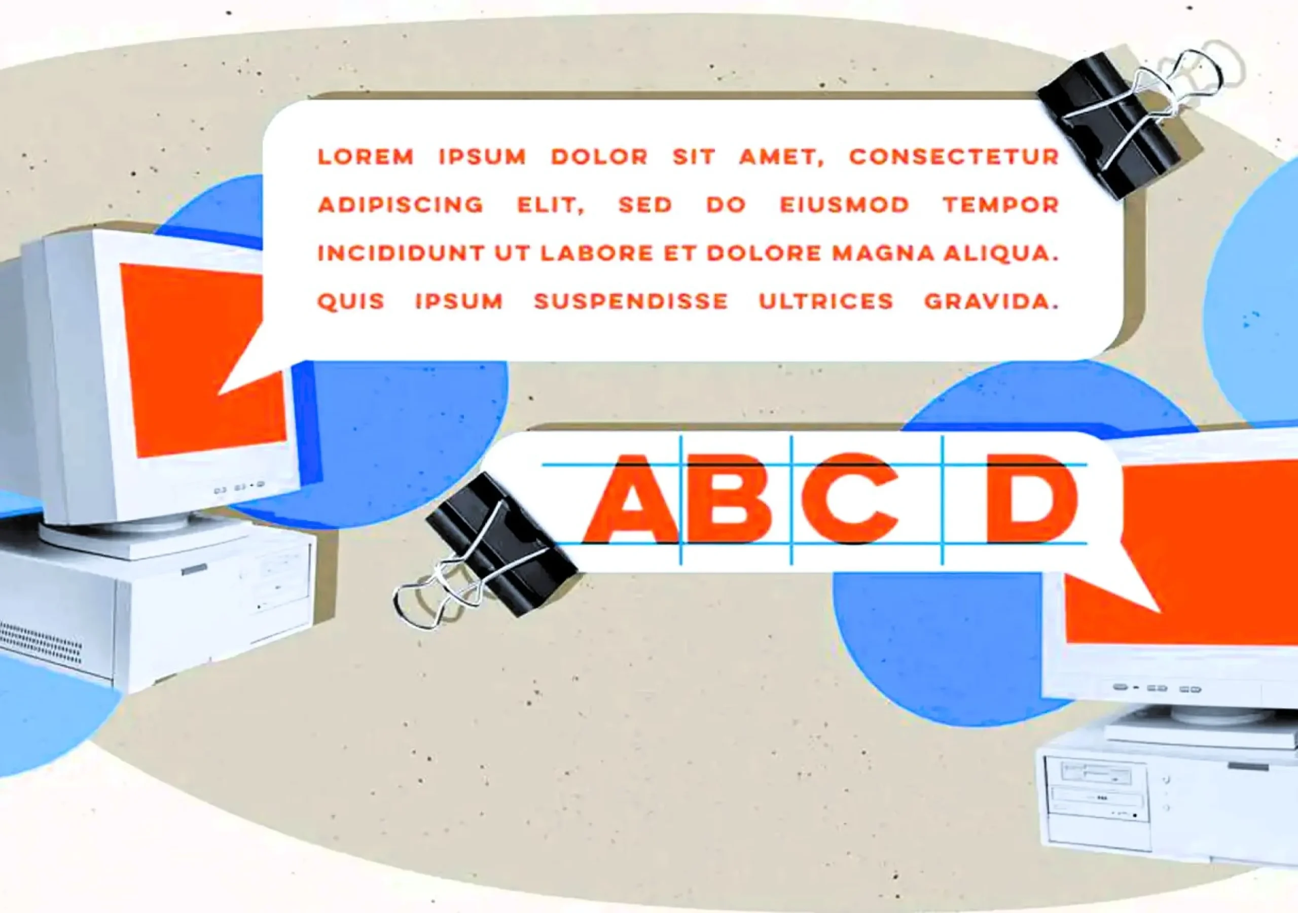
- It is one of the most vital aspects of visual hierarchy in UI designs. Adjusting the sizes, thicknesses, or styles of texts helps designers organize information so that headings pop out, sub-headings maintain flow, and body texts are legible. Therefore, this means that important bits of information have to be put in bold or big letters while those that are less important may use small light fonts. This makes it easy for users to read through and comprehend content effectively hence enhancing user experience and also making it readable
Closeness:
- Relatedness is perceived from the groupings. Therefore, spacing and grouping contribute towards making users understand relationships among elements displayed on the screen. Visual hierarchy’s proximity means grouping common elements so that individuals comprehending them can easily ascertain their significance and correlation
Negative space:
In other words, whitespace refers to surrounding empty spaces for different components. The purpose of this is to avoid clutteredness which makes the interface easy to digest while directing user attention to significant areas.
Alignment:
- Consistently aligning them either to the left, center or right side creates orderliness that allows for easy navigation through the interface by users. Cleanliness and organization of the layout through the arrangement of components as visual hierarchy alignment enhances the user’s focus as well as ease of reading
Repetition:
- This is done by repeating some design aspects within an interface. Such as colors or shapes help reinforce visual hierarchy making it more cohesive
Weightiness:
- Balancing out everything hence preventing one area from getting too much loaded thus making it feel more balanced as well as harmonious as possible among interfaces
Examples of Visual Hierarchy in UI Design:
- Landing Pages: Usually use big, big headlines to catch eyes first, then smaller sub-headings and full written text. In most cases, call-to-action buttons are very noticeable for their size and hue.
- Forms: Crucial fields such as name field or email field might just receive bigger sizes or size-wise dominate while the small ones are just not very important.
- Navigation Menus: Mostly, primary navigation options are larger or bolder than the secondary ones and frequently located at the top side or left-hand side of the interface.
Conclusion:
One of the cornerstones of UI design is visual hierarchy. Which allows users to use an interface without much thought. Sensibly arranging all elements according to their significance makes it possible for designers. To create both nice-looking and friendly user interfaces that result in more engagement and satisfaction.
Frequently Ask Questions
In UI design, visual hierarchy refers to the arrangement and presentation of interface elements in a way that directs the reader’s eye through the content thus prioritizing what they see first.
It enhances user experience by making the interface intuitive and helping users find key information quickly and efficiently.
Visiting larger elements draws more gaze and they give more importance to what they hold.
The use of bright colors and high contrasts would help different pieces stand apart while soft shades may give indications of secondary items
It is easy to find one’s way around typography because it separates the various levels of content like headers, sub-heads, and body texts
Most importantly, proper alignment results in a structured layout, thus a clean organized interface that enhances readability
Elements that are close to each other are seen as related, which assists users in understanding how different content pieces connect.
Whitespace allows for content demarcation hence reducing clutter while allowing vital elements to stand out
Essentially, through reduces confusion as well as guides people through various materials, and makes their interactions easier on them all together thus improving a person’s entire cycle through all these things called interactions between themselves and computers or software used to create them.
