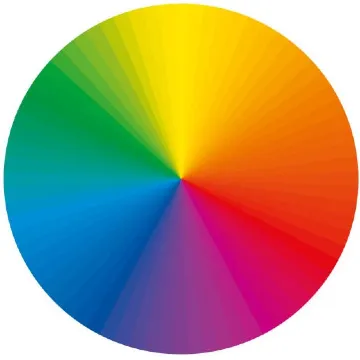
1st understand What is Color Theory.
The color theory has been established as a guide for artists, designers, and creators to comprehend how colors interplay, intermingle, and influence people’s feelings and thoughts. It assists in achieving an attractive arrangement of colors with legitimate purposes. Color Theory In UI Design
Color Theory In UI Design
- UI (User Interface) design relies heavily on color theory, which controls not just the visual appeal, but also the utility and usability of digital items as well. Here’s an overview of how to incorporate color theory into UI design:
Key Components of Color Theory:
Color Wheel: A circular representation of colors based on their chromatic interaction is known as a color wheel. Sir Isaac Newton initially devised it in 1666.
- Primary Colors: Red, blue, and yellow. They are the elementary colors that cannot result from mixing any other color.
- Secondary Colors: Green, orange, and purple. This occurs when two primary colors are combined.
- Tertiary Colors: Colors that result from the combination of one primary and one secondary color (for instance, red-orange or blue-green).
Harmonization of Colors:
- Opposing Colors: On the contrast wheel of color, these two are located opposite each other (red and green for instance). They produce vividness as well as large diversity when put together.
- Adjacent Colors: Those colors that are side by side with one another on the color wheel (for example, the hue blue-green). Correspondingly these hues often combine effectively resulting in unstressed and easily approachable designs.
- Triadic Colors: A trio of hues that are spaced evenly in a circular manner around the color chart (for example, red, yellow, and blue). Such combinations enable frequent bright yet stable arrangements frequently.
- Monochromatic Colors: Using various shades, tints, and hues generated from one particular color. The result is an outfit that has a simple but beautiful character.
Color Properties:
- Hue: The basic color like red, blue, or yellow.
- Saturation: It method how extreme or natural a shadeation is. When saturation is high, colors appear more vivid while low saturation makes them appear muted.
- Value: It means the lightness or darkness of a color. Adding white leads to tints (lighter), whereas adding black leads to shades (darker).
Color psychology:
- Red: Often related to energy, passion, and urgency.
- Blue: Represents calmness, trust, and stability.
- Green: Symbolizes growth, nature, and tranquility.
- Yellow: Evokes happiness, optimism, and caution.
- Purple: Associated with luxury, creativity, and mystery.
Application in Design
- Creating Mood: In the designs, colors are used to bring forth different feelings or moods.
- Visual Hierarchy: Colors serve as signals for directing users’ attention to significant aspects.
- Branding: Applying the same color scheme throughout enhances brand identity and communication.
Importance of Color Theory:
- It is critical for all who participate in making visuals to know color theory since this is a basis for deciding on colors that not only improve an aesthetic value but also serve other purposes such as functionality or inducing certain moods.
Contrast and Accessibility
- Contrast Ratios: It is crucial for readability that there is enough contrast between the text and the background colors especially for visually impaired people.
- Accessibility: When choosing colors, keep in mind the accessibility making sure that everyone can read them including colorblind people. For instance, using tools such as contrast checkers can ensure your design is accessible to everyone.
Colors in Branding
- Consistency: Uniform use of brand color throughout UI helps fortify brand identity whilst creating a unified user experience.
- Emotion and Perception: A company’s values should align its palette to evoke the appropriate feelings in its customer base.
Practical Application in UI Design
- Hierarchy: Visual hierarchy can be established by way of color thus directing users’ focus toward important things on any given screen.
- Feedback: The use of clicking to change color on success or errors like green or red hence making everything clearer and more comprehensible.
Combining eye-pleasing colors with usability is what UI design’s color theory is all about; It ensures harmony in UI design by choosing colors that seem nice but are also helpful to the totality of the user experience.
Frequently Ask Questions
Color theory in UI layout involves using the principles of colors to come up with visually appealing, functional, and easy-to-navigate interfaces. It entails knowing how colors relate with one another, how they mix, as well as their effects on users’ moods and actions.
Color theory is significant for UI design because it aids designers in producing visually attractive interfaces that offer a good experience to the users, communicate appropriate feelings, and effectively direct the attention of the users.
This part of psychology studies how colors affect a human’s feelings and behavior. By understanding color psychology it helps designers in selecting hues that can influence users’ minds with trust, excitement, or even calmness in UI design
Colors that can be contrary every different at the ideation wheel are referred to as complementary colors. They create very high contrast when used together. In UI design, these are often used to draw attention to important features and to make the interface more interesting: for example, bright complementary colors may be applied to buttons that call for action.
Adequate contrast between text and background colors can be achieved by applying color theory which enhances readability for persons with affected vision through this arrangement. It also means using tones that will not mix up with one another, making it easier for those who see colors differently.

Visual Hierarchy In UI Design - Digital AniViPractice
[…] UI design, visual hierarchy places and presents elements to indicate their importance. Allowing effective […]