Design Psychology: The Impact of Color on UX and User Engagement.
Color is not just decorative — it can be a form of communication. Color is important in UX design because it helps guide users, elicit emotions, and incite action. Whether you are developing a blog, app, or landing page, the right colors can determine whether a visitor bounces or locks in a conversion. In this post, we’ll identify the psychology of color in UX design, how distinct shades of color influence user engagement, and how you can leverage color principles to increase user engagement, trust, and conversion via your blog or website. Design Psychology: The Impact of Color on UX and User Engagement.
The Importance of Color Psychology in UX
Color influences user attitude, interaction, and decision-making. Research shows that people make their impression of a product within 90 seconds – up to 90% of that decision is based only on color.
In UX design, the use of color can help you:
- Create visual hierarchy, e.g., by visualizer or color sizing.
- Make your call to action stand out.
- Create brand recognition.
- Enhance readability and accessibility.
- Evoke emotion and/or behaviors.
Having a better understanding of the psychology of colors themselves can enable you to make better informed selections based on the context of the website, to improve user experience, and possibly conversion.
🧠 The Psychology of Choosing Common UX Colors
Let’s explore the emotional and functional traits of some colors commonly used in UX:
🔵 Blue: Trust, Calm, Professional.
- Typically used in finance, healthcare, or SaaS brands.
- Communicates reliability, confidence, and logic.
- Encourages user trust long-term.
- Best for: tech blogs, business platforms, productivity apps, etc.
- Example: Facebook, PayPal, LinkedIn
🔴 Red: Energy, Urgency, Emotion.
- Conveys excitement, passion, and danger.
- Drives people to make fast decisions and can create strong emotional reactions.
- Typical uses include sales, alerts, and error messages.
- Best for: CTA buttons, promotions, food blogs.
- Example: YouTube, Netflix, Coca-Cola
🟢 Green: Growth, Health, Balance
- Communicates nature, freshness, and safety.
- Typical uses include eco-friendly or financial consumption and wellness niches.
- Best for: sustainability blogs, health apps, and financial sites.
- Example: Spotify, Whole Foods, or Evernote
🟡 Yellow: Happiness, Optimism, Attention
- Bright and attention-seeking.
- Best to use sparingly since it can create eye fatigue.
- Good for drawing attention, creating offers, or just re-energizing the UI.
- Best for: entertainment, travel, lifestyle blogs, etc.
- Example: Snapchat, McDonald’s, or IKEA
⚫ Black: Power, Elegance, Sophistication.
- Indicate luxury, exclusivity, and authority.
- Best with lots of white space or minimalist design.
- Best for: fashion blogs, luxury brands, photography portfolios, etc.
- Example: Apple, Chanel, or Tesla
⚪ White: Simplicity, Clarity, Space Signifies purity, purity, freshness.
- Associated with purity and cleanliness.
- White is used in minimalist and modern UI design schemes.
- A great color to reduce cognitive load.
- Best for any niche as a neutral background.
- Example: Google, Airbnb, Notion.
🟣 Purple: Creativity, Luxury, Wisdom.
- Associated with royalty and something unique.
- Encourages imagination and reflection.
- Best for design studios, personal brands, and spirituality blogs.
- Example: Twitch, Yahoo, Glossier.
Using Color in UX Design
1. Determine a Color Hierarchy
Color is an effective way to visually orient the user to the importance of certain items, for example,
- Primary CTA buttons = fully saturated, bold colors
- Secondary buttons = muted shades. Background = neutral background to help with clarity.
- Tip: Ideally, your primary brand color should be identified at touchpoints/icons — buttons, links, and highlights.
2. Incorporate the 60-30-10 Rule
A traditional colour rule, which gives you a good approach to balanced visual design:
- 60% – dominant colour (background),
- 30% – secondary colour (headers, menus),
- 10% – accent colour (buttons, CTAs).
This structure ensures that you don’t overload the user.
3. Use Contrast for Readability
Check high impact/visibility/contrast between the text and background – this helps to provide accessibility and legibility, which is a key aspect of good UX. For example, black text on a white background.
You can check your contrast against headroom rules like:
- Contrast Checker (WebAIM),
- Stark (Figma Plugin)
4. Tie Colors into Your Audience
Similarly, colors suggest an array of emotions, and in these contexts, both culture, age, and gender play an important role. Things to consider are:
- Younger users prefer bold, bright colours.
- A locally professional/corporate audience attracts cooler tones.
- Wellness and lifestyle colours identify strongly with natural tones.
Research Tip: Check out Google Analytics or Hotjar heatmaps to confirm how users react to different colour elements in your site design.
5. Use color to indicate action.
Use an energizing color, like red, green, or orange (whatever fits your colors best) to make your call-to-action buttons stand out! This visually indicates urgency and improves your click-through rate (CTR). Example: A green “Get Started” button on a white background is more effective than a drab gray button.
🎯 Color psychology, in action:
Real examples from blogs.
Here are real examples of how bloggers and content creators used color to assist with UX:
✍️ UI/UX design blog
- Uses cool, muted colors like navy and gray for trust and clarity.
- The buttons use teal to fit within the design audience with a friendly and modern vibe.
📹 Video editing blog
- Used high contrast dark mode, with red accents to pop tutorials and featured videos.
- Maintains high energy and attention.
📘 Educational blog
Blue and white colors dominate credibility and cleanliness, with warm orange buttons for users to sign up or download free resources.
💡 Bonus UX Tip: Use only 2–3 core colors.
- Using too many colors will confuse your users.
- Limit the color palette to:
- Strengthen your brand identity, minimize decision fatigue develop a polished, cohesive design.
- You can use free tools such as Coolors, Adobe Color.
🛠 Money Colors Tool
- Figma – Apply the company’s set color styles for brand consistency.
- Material Design Color Tool – allows you to check contrast and see new themes and previews.
- Happy Hues – publishes tailored color palettes with example usage.
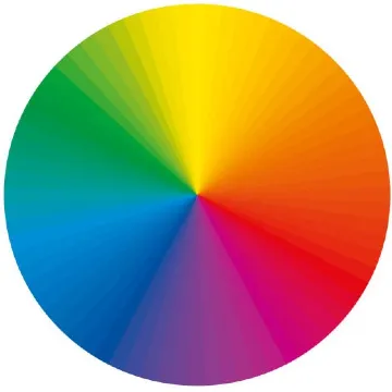
- Canva Color Wheel – a basic and simple tool to review combinations.
🧠 Final Notes –
Color is a User Experience Superpower.
In UX, color is more than ornamental! It’s an effective tool for user emotion, confidence, decisions, etc. You can design experiences that are beautiful + effective + engaging by using color psychology.
Whether you want to develop a readable blog or have conversions, the perfect color palettes are your mute friend for UX. Design Psychology: The Impact of Color on UX and User Engagement.
Frequently Ask Questation
Colors shape how users feel and interact with your interface. They can convey emotion, direct attention, impact readable, motivate to engage with a digital element (e.g., convincing users to click a button, moving to the next page etc ) and influence decisions (e.g., stay on the page), and are one of the most useful tools for designing an effective user experience
Red (or orange) can create urgency and increase clicks on call to actions (CTAs) while blue can impart stability and calm. By learning to apply and be strategic with colors, designers can influence behaviors such as subscriptions, purchases, and improving page views, ultimately increasing conversion rates
2-3 main colors are ideal: a primary brand color, and highlight color (to emphasize), and an accent color (to balance)… This ensures cohesiveness in our designs, not clutter. Also, follow a colour ratio of 60-30-10.
Here are a few: Coolors.co – Colour palette generator, Stark (Figma plugin) – accessibility checking, Adobe Color – colour palette generation & contrast testing, Happy Hues – curated colour combinations with real-world example

