How to Create a UX Case Study in 2027 (Step-by-Step Guide for Beginners & Designers)
To create a powerful case study, you need to tell the story behind your design decisions, not just showcase your passion for creating aesthetically pleasing user experiences in 2027.
A strong UX case study can be an effective way to differentiate yourself from other user experience designers when building a portfolio, seeking employment, or developing a personal brand.
This guide will teach you the steps to create a UX case study in 2027 using current trends, including AI tools, storytelling, and data-driven design.
What does a UX case study involve?
A UX case study tells the story of how you approached solving a user issue and how design thinking contributed to that process.
It includes:
- • The steps you took
- • The reasoning behind those steps
- • Your technical ability to solve the task at hand
- • Your overall solution
When considering UI design, remember that it is only part of the equation.
Your reasoning and decision-making processes are equally important as the final design.
Why UX Case Studies Matter in 2027
By 2027, employers and clients will expect to see more than just a UI design; they will be looking for evidence of:
- Effective problem solving,
- Thoroughness of your user research,
- Making data-driven decisions,
- Creating meaningful, real-world impact through thoughtful design.
An actual case study demonstrates how you think strategically rather than just being a designer.
Step 1: Select the Correct Project to Work On.
Start by working on a project that demonstrates the following:
- A real-world problem (not just redesigning something for fun),
- Identifiable User Pain Points,
- Measurable Results.
Examples of Good Projects:
- Improving the Shopping App Experience When Making Purchases,
- Redesigning a Blog to Increase Engagement,
- Creating a Mobile Application for Local Users.
👉 Tip: Even a personal or student project works if explained well.
Step 2: Write a Clear Problem Statement.
Your case study should begin with a strong problem.
- Example: “Users were abandoning the checkout process due to a complex UI and lack of trust signals.”
Make it:
- Specific
- User-focused
- Data-supported (if possible)
Step 3: Research will be a requirement in 2027. Use the following methods when performing your research:
- User Interviews
- Surveys
- Competitor Analysis
- AI Generated Insights
You will need to include the following in your case study:
- Key findings
- User Pain Points
- Behavioral Patterns
👉 Pro Tip: Utilize charts and/or bullet points to easily convey your research information.
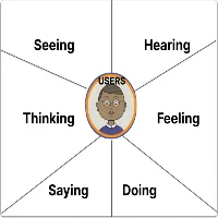
Step 4: Write User Personas
User personas will help you to build an experience based on actual users. Details of a user persona should include the following:
- Name, age, occupation,
- goals,
- pain points, and
- behavior patterns.
👉 Simple is better, so don’t over-design a persona.
Create a Map of the Users’ Journey in Step 5.
Your users’ journeys show what they do when they access your product.
You’ll want to include the following within the map or diagram of the user journey:
- Entry Point
- User Actions
- User Pain Points
- User Emotions.
This information will demonstrate:
- 👉 Where users have problems
- 👉 Where the design enhances the experience.
Define Your Solution in Step 6.
You will now describe your design method.
Your design method should answer the following:
- What did you change?
- Why did you change it?
- How did it fix the problem?
👉 Use various items to support your explanation.
- Wireframes,
- screenshots
- before vs. after comparisons,
Showcase user interface design, but Avoid Concentrating on it in Step 7.
The user interface is very important; however, it is only a part of the overall user experience.
For your UI, please show the following:
- Completed Screens
- Design System (colors and fonts)
- Design Components
👉 Please keep your explanation brief and concentrate on user usability.
Add Usability Testing in Step 8.
The only way to guarantee success is to perform testing on your designs.
Your testing data will include the following:
Type of Test
- Number of Users in Test(s)
- Most Valuable User Feedback
- Changes Made to Product Based on Usability Testing
👉 This will demonstrate that you incorporated real user feedback into your design.
Step 9: Present Outcomes and Effects.
This is a pivotal section of the project.
Document results in some way:
- Rates of conversion have increased,
- The Bounce Rates have Decreased,
- The time to complete was cut down.
For example, the percentage of users completing the entire checkout process improved by 35% after a redesign.
👉 If there is no real data: List hypothetical effects or reasonable assumptions as to how it will impact the business.
Step 10: List Learnings & Reflection.
You will stand out here. Include:
- What went well,
- What did not work,
- What to do differently.
👉 Employers find the designers who reflect and learn from what they have created, have better value.
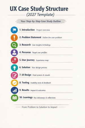
(2027) UX Case Study Format
Use this template:
- Introduction
- Problem Statement
- Research
- Personas
- User Journey
- Solution
- UI Design
- Testing
- Results
- Learnings
Latest Trends in UX Case Studies (2027):
1. AI-Assisted Research Designers now utilize AI tools for:
- Analyzing user behavior
- Generating insights more quickly
2. Storytelling Format:
Case studies are composed like a narrative instead of reports.
👉Beginning → Problem → Journey → Solution → Outcome
3. Short & Visual Content
Recruiters prefer documents that consist of:
- Concise paragraphs
- Visual explanations
- Clean layouts
4. Real Metrics vs. Fancy Designs
Actual impact is more influential than how visually pleasing the project is.
Avoid Mistakes
- More UI than process.
- No clear problem.
- Not doing research.
- No measurable results.
- Over length.
Maintain clarity, structure, and focus.
Advice for Novices to Help Them Build Their First UX Case Study:
1. Start with 1-2 great case studies.
2. Work on your ability to express clarity versus working towards perfection.
3. Use simple terminology.
4. Display your thought process.
5. Consistently enhance the content of your case study.
Final Thoughts
In 2027, ideally, when creating a UX case study, you will be able to portray a compelling narrative that conveys your ability to communicate your findings via logic, research, and results.
A large-scale project does not have to be utilized for an individual to present himself/herself as an effective designer. If someone were to perform a straightforward redesign of an existing product or service and do it well, this redesign could be a strong case study.
Good Design Shows Visuals. Great Design Shows Thought Process.
Create your case study today. Thank you!
Frequently Ask Questions
A case study in user experience (UX) is a document that details how a designer uses research, design thinking, and testing to resolve a user’s problem. In 2027, UX case studies are less reliant on visual representation and more focused on data, storytelling, and impactful results.
How much content should a case study contain?
An acceptable length of a case study in user experience is between 800 and 1500 words or five to ten scrollable sections. It needs to present enough information about your process to describe it adequately, and still be concise enough to hold the reader’s attention.
What should someone new to user experience design include in their case studies?
Someone new to user experience design should provide the following information in their case study:
A problem statement,
User research,
A persona,
The user journey,
The solution
Measurable results