Empathy Mapping in Design Thinking: A Guide to Human-Centered Innovation (2025)
In a world already full of products, apps, and services. The ones that will win out are those that allow users to connect. And that connection isn’t made from thin air—they need to be anchored in empathy. Empathy mapping is the simplest way for designers and teams to embody their users through the design thinking process. In 2025, where personalization or emotional connection can make or break success, knowing about empathy mapping is more important than ever. In this blog we’ll uncover what empathy mapping is, how empathy mapping fits into a design thinking process, the steps to create an empathy map, and why empathy mapping is a game changer for developing meaningful user experiences
🚀 What Is Empathy Mapping?
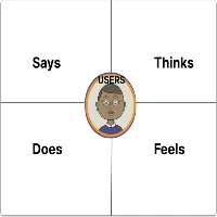
Empathy mapping is a collaborative visualization technique used in UX and design thinking that aims to understand a user’s thoughts, feelings, needs, and behavior. It allows teams to deeply examine a users’ mindset, and understand more than just their demographics and how they engage with a product.
Whereas analytics emphasizes what users do, empathy mapping examines why they do it. Empathy mapping is not about all the latest psychological research, perception theories or human experience—the process is designed to highlight the different influences that drive people to think, act and feel in specific ways.
🎯 Why Is Empathy Mapping Important Within Design Thinking?
Design thinking is a cycle of thinking and doing in a user-centered approach that is designed to tackle complex problems through empathy, ideation, prototyping, and testing. Empathy is not only the first, but the most important phase of design thinking. The way you can engage with empathy is by using empathy mapping.
Here are some of things empathy mapping adds to the process:
- ✅ Identify real user needs (not just assumptions)
- ✅ Create alignment across teams when it comes to needs of users
- ✅ Generates divergence through focusing on user feelings and motivations
- ✅ Enables prioritizing user-centered solutions when prototyping and thinking of testing
- ✅ Decreases the likelihood of building the wrong solution
In short, empathy mapping helps to ensure that you are not just building for users, but building with a strong understanding of users.
🛠️ How to Create an Empathy Map (Step-by-Step)
It doesn’t matter if you’re a UX designer, blogger, startup founder, or product manager. Creating an empathy map is a simple and effective exercise to do.
- Step 1: Pin down a user persona Narrow down into a specific target user group or user persona. Focus on real research findings – interviews, surveys, and feedback.
- Step 2: Pulling insights Gather qualitative insights from: User interviews Surveys Support tickets Product reviews Behavior analytics (though look at the data empathetically)
- Step 3: Map the 4 quadrants For in person, use sticky notes. For collaborative environments, use Figma, Miro or FigJam. Complete each of the four quadrants with the insights you gathered.
- Step 4: Add goals, pains, gains Additional maps may include: 💥 Pains 🎯 Goals or needs 🏆 Gains or outcomes they want
- Step 5: Analyze and align Take your map, review it as a team, discuss how this information will influence design decisions, content strategy, or feature development
🌍 Real-Life Example: Empathy Map for a Travel Blog
Let’s say you are running a travel blog that’s geared toward solo female travelers.
- Persona: Priya, 29, solo traveler from India.
- Says: “I want to travel to new places, but safety is a main concern.
- Thinks: “Will I be able to find a reasonable, women-friendly place to stay?”
- Does: Follows female travel influencers, looks up vlogs on YouTube, will not book travel unless she finds reviews that have a significant detail.
- Feels: Anxious and excited, cautious yet full of hope.
So How does this help? You could create content around:
- “Top 10 Solo Travel Destinations Safe for Women in 2025”
- “Affordable Women Only Hostels in Europe.”
- “What to Pack as a Solo Female Traveler (with running with safety gadgets.)”
This makes for relevant, exciting, and trustworthy blog content – based directly on user pain, emotions & needs.
🔥 Expert Advice for Utilizing Empathy Mapping in 2025
- Collaborate – Use boards like Miro or Figma for real-time collaboration.
- Evaluate often – Update maps after user testing or surveys.
- And don’t base it on assumptions – Insights should be based on actual data.
- Use it beyond just UX – Use in content planning, branding and product marketing.
- Combine the map with a journey map – tracking the empathy throughout the users’ journey will yield deeper insights.
📈 SEO Tip: Why This Blog post matters for Search
The keywords “Empathy Mapping in UX”, “Design Thinking Tools” and “User-Center Design 2025” are popular keywords in the UX and product design space.
Meta Description:
“Understand how empathy mapping drives user centered design in 2025. Explore each of its 4 quadrants, how it integrates into design thinking, and how to use it in practice for UX.”
Proposed Keywords:
- empathy map UX
- design thinking empathy
- how to create empathy map
- user research tools 2025
- UX design trends
Final Thoughts: Use Empathy As Your UX Superpower
Empathy mapping isn’t a buzzword. It is a useful, effective tool that changes the way you will design, write and innovate. In 2025, when users expect personalized, emotionally intelligent connections, leveraging empathy maps can make the difference between “meh” and *memorable*.
So, if you are designing a new app, starting a new blog, optimizing user flows, or anything in between, start with empathy. The results will speak for—and *to*— you.
Freaquently Ask Questations
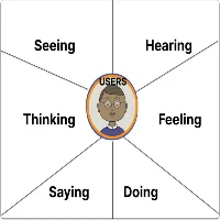
An empathy map is a tool used in the design thinking process to visually represent an understanding of a user’s thoughts, feelings, behaviours and ultimately motivations. It helps teams immerse themselves into their user’s mind to better understand the full scope of the user’s experience, including pain points, needs, desires and decision-making tendencies. The goal is organizing the insights into 4 quadrants: Says, Thinks, Does and Feels so that the team can build a richer human-oriented solution.
Empathy mapping allows UX designers to embed emotional intelligence into their products and experiences. It allows designers to ensure that they design based on the real needs of their users in their present context, rather than the designer’s assumptions. Understanding users’ emotions and motivations can help designers design user journeys with more intuition and with consideration for the whole person, inclusivity, and user impact, ultimately leading to better outcomes with their engagement in the experiences designed.
In 2025, tools such as figurative, Miro, Mural, and FigJam have templates for empathy maps ready to go. You would start by defining a user persona, gather data from them through user interviews and/or user surveys for the empathy map content, and score what they put down into the 4 quadrants which denote how they feel and behave (Says, Thinks, Does, and Feels). You can utilize many features of todays tools that allow you to collaborate with your team in real-time, include sticky notes and integrate previous user research to help map the experience even more quickly!
A persona is a fictitious characterization of user demographics, goals, and behaviors, while an empathy map explores the psychological and emotional side of that user. You can think of the persona as who your user is, and the empathy map as how your user feels and thinks. Overall, these two tools complement each other in UX design and design thinking.
Absolutely. It is useful for marketing, content strategy, customer service, and branding as well. For example, bloggers utilize empathy maps to produce the type of content that resonates with readers emotionally. Marketers utilize empathy maps to produce messaging that is relevant to customer concerns and aspirations.