Breadcrumbs UI Design 2025: Meaning and Importance
In the fast-evolving world of user interface (UI) design, including breadcrumbs in the mix, has not just been used to upgrade usability, navigation, and even the entire user experience (UX). By 2025, they would sprout into a thread to stitch all buildings into seamless digital journeys that transform webs and applications. This blog elaborates on the meaning of breadcrumbs in UI design and its types, benefits, and best practices. Thus, it becomes a necessary stop for any designer who wishes to up their game in engagement and traffic-they will end up having to experience the missing parts.
What is Breadcrumb in UI Design?
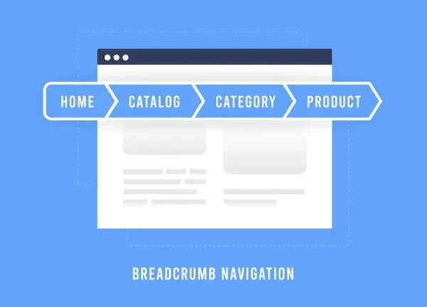
Breadcrumbs in UI design refer to a type of navigation structure that enables users to know their location on a certain site or within an application. It relates to how Hansel and Gretel will keep breadcrumbs to get back to their homes and expect them to be breadcrumbs that allow users to retrace their steps or return to previous portions.
Typically, it appears as a horizontal text link divided by some symbols (like “Home > Category > Subcategory > Page”): it makes navigation for new or experienced users easy when faced with complex sites with many levels.
2025: The Year for Transformation of Breadcrumbs
Present breadcrumbs in 2025 cannot stay static anymore. They have revolutionized to meet modern interactive user-centered design needs. Present-day breadcrumbs are:
- Dynamic and Contextual: For adapting to user behavior or search intent.
- Voice-Activated: For hands-free navigation using AI-driven voice commands.
- Responsive: For making them mobile-first and multi-display.
- Accessible: Having inclusivity for the visually impaired using screen readers.
Different Types of Breadcrumbs in UI Design
Location-Based Breadcrumbs
- Indicates the user’s position in the site hierarchy.
- Example: Home > Blog > Design Tips > Breadcrumb UI.
- Best suited for large content-heavy multi-layered sites such as e-commerce stores and blogs.
Path-Based Breadcrumbs
- Show the trail of pages visited by the user.
- Example: Home > search results > product page > checkout.
- Suitable for directing users through convoluted workflows or funnels.
Attribute-Based Breadcrumbs
- They are those that show filters of attributes on which the browsing is done.
- Example: Home > Electronics > Smartphones > Brand: Apple > Price: $500 – $1000.
- Common in e-commerce sites for filter-based browsing.
Benefits or Gains of Bread Crumbs in 2025
Better Usability
- Bring users to levels above using breadcrumbs to make navigation clear and easy to return to categories instead of confusion and frustration.
Improved User Engagement
- This allows a quick perusal of related content or products, increasing the time spent on the site while reducing bounce rates.
Benefits of SEO
- Improves the overall site structure and crawlability regarding SEO efficiency.
- It is called a breadcrumb in an actual search engine for increased CTR since search engines generally display breadcrumbs in their results.
Accessibility and Inclusivity
- Here is an accessible and inclusive navigation aid for all users, including those depending on assistive technologies such as screen readers.
Navigation on Mobiles
- In the year 2025, breadcrumbs will be optimized for mobile devices by ensuring great navigation on small screens, as one would do with a wider screen.
Best Practices in UI Design of Breadcrumbs
Simple and Intuitive
- Use concise, meaningful labels for each breadcrumb link.
- It is easy to feel overloaded with too many levels or so many options.
Make Breadcrumbs Clickable
- Every breadcrumb must be an active link, which enables the users to navigate directly into the desired section.
Visual Cues
- It should have symbols like “>” or “/” separating the breadcrumbs levels into an uncluttered collective display.
Optimize for Mobile
- Responsive breadcrumbs will be thumb-friendly, enabling mobile users.
- Long breadcrumb trails will be enabled for collapsing or, even better, for horizontal scrolling.
Schema Advantage
- The schema would be an added advantage for having breadcrumbs appear in search engine results for better visibility through structured data (BreadcrumbList schema).
Accessibility Testing
- Test breadcrumbs with screen reading equipment or other assistive devices to ensure that it is possible to use them by all users.
Modern UI Elements Case Uses for Breadcrumbs
E-Commerce Website.
These breadcrumbs are mostly used in a variety of product categories and tiny filter queries drive users to find their products and compare them with one another.
- Example: Home > Women’s Clothing > Dresses > Casual Dresses.
Educational Platforms
Compasses allow students to take courses, classes, and modules without losing track of their progress.
Example: Dashboard > Courses > UX Design Basics > Lesson 3.
News Portals and Blogs
Breadcrumbs categorize articles under topics and sub-topics, especially sites with lots of content.
Example: Home > World News > Climate Change > Article Title.
SaaS Applications
Breadcrumbs provide a magic touch in guiding users through an intricate maze of dashboards and devices, improving work efficiency.
The future of breadcrumbs technology is within…
Artificial Intelligence
- Dynamic breadcrumbing that adapts to user behavior for the most personalized navigation path would be a feature of UI in 2025.
Voice and Gesture Integration
- Breadcrumb browsing encourages interaction from a particular technology, such as voice activation or gesture, providing more accessibility.
Augmented Reality (AR)
- AR applications use breadcrumbs to guide users through virtual environments, enhancing digital experiences.
What Not to Do in Breadcrumb UI Design
Overpopulating Breadcrumbs
- Never include every level of the site hierarchy, as it can be overwhelming.
Inconsistent Placement
- Users should find breadcrumbs consistent from page to page on the top of a page for easy referencing.
No Optimization for Mobiles
- Ensure the ‘bread crumbs’ are responsive and do not break or become unusable on mobile devices.
Poor Labeling
- Use descriptive tags, which clearly state the content and/or category.
How breadcrumbs pull traffic and keep people engaged
Users can be retained and engaged by using breadcrumbs to make navigation intuitive and effective, for set examples:
- A user browsing online may find it much easier to return to the product category than to leave the site entirely.
- A blogger might find it more conclusive to read another blog due to the breadcrumbs that link users to other posts, thus increasing page views.
- This impact becomes amplified when considered in conjunction with the broader SEO benefits, comprising those increases in site ranking and organic traffic gains.
New Trends for the Timeline in the UI Breadcrumbs Design
- Contextual Breadcrumbs: Breadcrumbs can change based on user intent and context rather than straightforward navigation.
- AR and VR Immersive Environment Breadcrumbs: Breadcrumbs that will guide the users through such settings involve virtual stores or digital learning platforms.
- Intelligent Navigation: Predictive routes for users based on their behavior and what they prefer are thus offered by AI-powered breadcrumbs.
The conclusion:
Leaving a gap between needs and functionalities is a good thing for breadcrumbs in terms of UI design in 2025. A new-age breadcrumb dynamic, accessible, and SEO-compliant would give a design great user-intuitive navigation experience and keep traffic high.
Whether working with e-commerce, education, or SaaS applications, breadcrumbs can make the journey across even the most complex digital settings easier and more enjoyable. Start optimizing your breadcrumbs now, and watch your traffic increase in tandem with your site’s usability.
Frequently Ask Questions
What exactly are breadcrumbs in UI design?
Breadcrumbs, in a nutshell, have been described as an art of secondary navigation that graphically shows a visitor’s standing within a website or app. They take the users into an orderly hierarchy and help them navigate backward to the proper levels without any disorientation.
Why would breadcrumbs be important in 2025?
By way of easier navigation, breadcrumbs optimize usability along with increasing the extent of user engagement while having an impact on the SEO ranks. These will also be integrated into mobile-first designs and AI personalization trends in 2025
How do breadcrumbs improve SEO?
Breadcrumbs structure the site better hence crawlers are enabled to crawl and index the content better. They also appear on search engines thus increasing probabilities in CTR
Do breadcrumbs apply to mobile applications?
Well, “breadcrumbs” would then become truly responsive and mobile-friendly in 2025 to offer uncomplicated navigation on smaller screens and within mobile apps