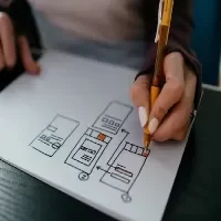
17 UI Design Elements. UI design components are what form user interfaces. They aid users in communicating with a digital product. Thus generating an appealing and practical experience at the same time. The fundamental UI design elements are listed below:
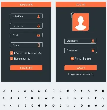
1. Buttons
- Function: Allow users to execute certain tasks (like submit, save, or cancel).
- Varieties: Primary, secondary, ghost buttons.
- Recommended Practices: Buttons must have clear titles, visible and well-matched colors as well as sizes
2. Icons
- Function: A depiction that embodies usability by making actions or categories easily identifiable.
- Classification: Navigation icons (home, search), action icons (edit, delete), status icons (loading, error).
- Best Practices: Simple symbols understandable everywhere in the world and if necessary accompanied by textual labels.
3. Text Fields
- Function: For entering texts in forms such as login screens or search engines.
- Types include: Single-line (name/email) and multi-line (comments/feedback).
- Best Practices: Label texts clearly; use helpful placeholder information within them. Provide clear validation/error messages ensuring errors are easy to spot.
4. Navigation
- The purpose of navigation is to help users find their way around an interface.
- The types include navigation bars, side menus, breadcrumb trails, and tab bars.
- Intuitive navigation sitewide across devices should be achieved since they need consistency.
5. Sliders
- Help users to change a value or to select from a range of options (like volume control, and price filters).
- Horizontal or vertical sliders are common.
- Labels on sliders need to be clear and also have start and end values as well as visual feedback for changes.
6. Forms
- Purpose: To request input from users.
- Elements: Text fields, drop-down list; checkboxes, radio buttons.
- Best Practices: Forms should be easy to read, organized so that they contain clear information, and give feedback in real-time (for example, validation errors).
7. Cards
- Purpose: To enable users to consume related content quickly into one block by grouping it.
- Use Cases: Product listings, blog posts, and social media feeds.
- Best Practices: Cards must have a hierarchy where images are placed together with titles and action buttons.
8. Modals (Popups)
- Purpose: Display more information or request an action without leaving the current page.
- Types include dialog boxes (confirmation alerts) and forms.
- Best practices categorize models as straightforward, easily closable, and non-disruptive to user experience.
9. Dropdown Menus
- Purpose: To provide users with a variety of choices.
- Types: Standard dropdowns; multi-selection dropdowns.
- Best Practices: Keep options easy to scan, and ensure that the dropdown is usable across all devices.
10. Progress Bars
- Purpose: To show users how far along in a process they are- loading or unloading, for example, or step-wise tasks.
- Types include linear or circular progress indicators.
- Best Practices: Use clear and exact progress indicators to give feedback and shape user expectations.
11. Notifications & Warnings
- Purpose: Give instant replies or notifications to the end user (Examples: messages indicating successful actions and warning messages indicating errors made or updates).
- Types: Toast notifications, banners, modal alerts.
- Best Practices: Clarity is key, therefore notifications should be brief and to the point without being loud. It is important to note that this is not a definitive list, since there other aspects of creating a beautiful and usable interface.
12. Tabs
- Purpose: Allow users to change different views or sections within the same context.
- Best Practices: Tabbed elements must be clearly labeled as well as visually distinctive.
13. Accordions
- The objective is to show or hide the additional content in collapsible sections.
- Frequently asked questions (FAQs) and expandable lists are examples of web pages with this feature.
- It is essential for an accordion header to be labeled so that anyone can know what they are opening or closing as well as visual indicators like arrows to tell when content has been opened or closed.
14. Toolbars
- The purpose is to contain related commands, tools, or actions regarding specific functions (for instance, text formatting in a word processor).
- Keep it simple and only include majorly used options for efficiency.
15. Breadcrumbs
- The purpose of breadcrumbs is to assist users in knowing where they are in the interface and return to previous sections.
- For example, there are websites with deep hierarchies of pages and e-commerce platforms for this use case.
- Therefore, visible and clickable breadcrumbs indicating a clear path should be ensured.
16. Pagination
- Splitting content into multiple pages allows users to jump from one place to another between these pages alone.
- This can apply to blog posts, product lists as well as large data sets.
- Therefore, make sure pagination controls are accessible enough while at the same time showing the current page clearly.
17. Toggle Switches
- These switches enable users to alternate between two states such as turning on and off or enabling and disabling.
- Use cases include settings toggles such as dark mode and notifications among others here too.
- A label that is easy to understand must be used while making sure that the default option is easily identifiable.
These elements are the most important part of designing user-friendly and attractive interfaces. The perfect UI design integrates these components seamlessly producing an interactive product whose use by its audience is both easy and automatic at the same time
Frequently Ask Questions
Components that constitute the visual interface of a digital product are known as UI design elements. Items such as buttons, text fields, icons, sliders, and navigation bars are included in this category in addition to other items that users interact with while completing tasks. This is aimed at making it more interesting to users while still being functional
UI design elements are primarily intended to improve user interaction with a specific product or service. They guide users through tasks, improve interface usability at large, and give feedback during interaction sessions. Moreover, they play a critical role in establishing a product’s visual appeal and brand identity.
UI design elements refer to all visual aspects of an interface as well as interactive ones such as buttons, icons, and forms among others while UX on the other hand focuses mainly on the user experience which entails flow, functionality, and usability of a product at large. Data collection considerations therefore take different perspectives depending on whether one is looking at UI or UX.UI is more preoccupied with looks/governance whereas UX looks into feelings during the usage of any item
The following are some of the most significant aspects of UI design:
Buttons: They enable users to carry out tasks.
Navigation Menus: They facilitate user movement through various parts of the interface.
Text Fields: These allow users to enter data or information.
Icons: These provide visual indications for different actions or categories.
Forms: They collect user data for activities such as signing up or checking out.
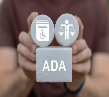
To make user interface components accessible:
Make sure there is a significant contrast between text and background for it to be legible.
Make certain that there are clear labels on buttons, forms, and icons.
Use larger components that are more easily clickable.
Make use of alternative texts for icons and images as a support for screen readers.
The users who experience disabilities should have a way of moving around with a keyboard.

