Bharat’s Sacred Colors: Impact on Modern Visual UX
Introduction: Beyond the Hex Codes
“एक UX/UI डिज़ाइनर का पूरा दिन फिग्मा पर बीतता है। हम परफेक्ट कलर पैलेट चुनते हैं, हेक्स कोड सेट करते हैं और कंट्रास्ट रेशियो चेक करते हैं। इसके लिए हम अक्सर मॉडर्न वेस्टर्न स्टडीज का सहारा लेते हैं। लेकिन क्या आप जानते हैं कि रंगों का असली विज्ञान हज़ारों साल पहले भारत में डिकोड हो चुका था? यह प्राचीन सिस्टम सीधे हमारी भावनाओं (Emotions) को प्रभावित करता है।”
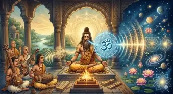
भरत मुनि के नाट्य शास्त्र (Natya Shastra) और प्राचीन शिल्प शास्त्र (Shilpa Shastra) में रंगों को केवल विजुअल नहीं, बल्कि ‘मानसिक अनुभव’ (Cognitive Experience) माना गया है। प्राचीन भारत का यह कलर सिस्टम आज के डिजिटल प्रोडक्ट्स के लिए एक एडवांस Visual UX Framework का काम कर सकता है। आइए एक्सप्लोर करते हैं कि कैसे भारत की पारंपरिक रंग चेतना मॉडर्न डिजिटल इंटरफेस को एक नई जान दे सकती है।
1. The Concept of ‘Rasa’ and Color: India’s First UX Matrix
नाट्य शास्त्र में भरत मुनि ने ‘रस थ्योरी’ (Rasa Theory) दी थी। ‘रस’ का मतलब होता है वह भावना या इमोशन जो एक यूजर (या दर्शक) किसी कलाकृति को देखकर महसूस करता है। सबसे मजेदार बात यह है कि हर ‘रस’ को एक निश्चित मूल रंग (Primary Color) से जोड़ा गया था।
आज के UX में हम इसे Emotional Design कहते हैं। प्राचीन भारत के इस कलर-इमोशन मैट्रिक्स को हम आज की यूआई डिज़ाइन गाइडलाइंस से कुछ इस तरह कम्पेयर कर सकते हैं:
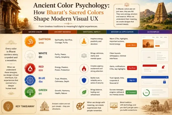
- 🔴 Rakta (Red) – Roudra Rasa (Power & Dynamism): प्राचीन काल में लाल रंग ऊर्जा, शक्ति और क्रोध का प्रतीक था। मॉडर्न UI में हम इसका इस्तेमाल एरर्स (Errors), महत्वपूर्ण अलर्ट्स (Critical Alerts) या ज़ोमैटो/नेटफ्लिक्स जैसे ऐप्स में ध्यान खींचने (High Engagement) के लिए करते हैं।
- 🟡 Pita (Yellow) – Adbhuta Rasa (Curiosity & Wisdom): पीला रंग मानसिक चेतना, ज्ञान और कौतुक का प्रतीक है। डिजिटल UX में, यह रंग ‘क्लिक करने की जिज्ञासा’ (Call-to-Action) जगाने या नए फीचर्स को हाईलाइट करने के लिए परफेक्ट माना जाता है।
- 🟢 Harita (Green) – Shringara Rasa (Harmony & Aesthetic Delight): हरा रंग प्रकृति, प्रेम और संतुलन को दर्शाता है। मॉडर्न विजुअल डिज़ाइन में यह रीफ्रेशिंग, रिलैक्सिंग और फिनटेक ऐप्स में ‘सक्सेस/सेफ्टी’ (Success state) का सिंबल है।
- ⚪ Shukla (White) – Hasya & Karuna Rasa (Clarity & Peace): सफेद रंग शुद्धता और मानसिक स्पष्टता का प्रतीक है। इसे आज हम Minimalist UI Design और Negative Space (White Space) के रूप में जानते हैं। जो यूजर के कॉग्निटिव लोड (Brain Stress) को कम करता है।
2. Navatantra Palette: Creating Emotional UI Layouts
जब हम किसी प्राचीन भारतीय मंदिर की पेंटिंग्स (जैसे अजंता गुफाएं) या पारंपरिक कपड़ों को देखते हैं। तो वहाँ मिलने वाले रंगों के कॉम्बिनेशन बेहद नेचुरल और आंखों को सुकून देने वाले होते हैं। वे कभी भी यूजर की आंखों को चुभते नहीं हैं। इसका कारण यह है कि प्राचीन डिज़ाइनर्स Navatantra Palette (प्राकृतिक और सात्विक रंगों) का उपयोग करते थे।
🎨 How to apply this in Figma:
एक मॉडर्न यूआई डिज़ाइनर के रूप में, आप इन प्राचीन रंगों के कॉम्बिनेशन का उपयोग करके बहुत ही एलीट, अर्थी (Earthy) और प्रीमियम UI Themes बना सकती हैं:
- The Spiritual/Calm Theme: Gerua (गेरुआ/Saffron) को प्राइमरी कलर और Chandan (चंदन/Off-white) को बैकग्राउंड बनाकर एक बेहद पीसफुल और ध्यान केंद्रित करने वाला (Focus-driven UX) इंटरफेस तैयार किया जा सकता है।
- The Heritage/Royal Theme: Mayur Pankhi Blue (मयूर पंखी नीला) और Suvarna (स्वर्ण/Antique Gold) का कॉम्बिनेशन किसी भी ब्लॉग या ई-कॉमर्स साइट को एक रॉयल और ट्रस्टवर्दी (Trustworthy UX) लुक देता है।
3. Visual Hierarchy and Cognitive Load: Learnings from Shilpa Shastra
“शिल्प शास्त्र प्राचीन भारत का आर्किटेक्चर और डिज़ाइन मैनुअल है। यह सिखाता है कि मूर्तियों या भवनों में रंगों का बैलेंस कैसा हो। इसका एक नियम है कि मुख्य ध्यान (Focal Point) हमेशा ‘मुख्य विषय’ पर होना चाहिए। बाकी सब कुछ न्यूट्रल होना चाहिए।
आज की डिज़ाइन भाषा में हम इसे Visual Hierarchy कहते हैं। अगर आप वेब पेज पर हर जगह चमकीले रंग भर देंगे, तो यूजर भ्रमित (Confused) हो जाएगा। प्राचीन भारतीय कला हमेशा 60-30-10 के नियम का पालन करती थी।”
- 60% न्यूट्रल या मिट्टी के रंग (Earthy/Base tones – Background)
- 30% पूरक रंग (Secondary colors – Structure)
- 10% अत्यंत चमकीले या गहरे रंग (Accent colors), जैसे सिंदूरी या गहरा नीला, जो सीधे यूजर का ध्यान आकर्षित करते हैं (Buttons, CTA)।
4. The Impact of Sacred Frequencies on Colors
चूंकि हमारा पिछला प्रोजेक्ट Vedic Sound Science पर था, इसलिए यह जानना बहुत रोमांचक है कि ध्वनि (Sound) और रंग (Color) आपस में जुड़े हुए हैं। जब हम किसी मंत्र का उच्चारण करते हैं, तो उससे पैदा होने वाली फ्रीक्वेंसीज़ अदृश्य विजुअल कलर्स के स्पेक्ट्रम को भी प्रभावित करती हैं।
प्राचीन ग्रंथों के अनुसार, हमारे शरीर के 7 चक्र (Chakras) अलग-अलग साउंड फ्रीक्वेंसी (बीज मंत्र) और विशिष्ट रंगों से जुड़े हैं, (जैसे—Root Chakra के लिए ‘LAm’ ध्वनि और लाल रंग)। एक विजुअल डिज़ाइनर के तौर पर, जब हम किसी वेलनेस, मेडिटेशन या हेल्थ केयर ऐप का यूएक्स डिज़ाइन करते हैं, तो इन चक्रों के रंगों और उनकी फ्रीक्वेंसीज़ का सही इस्तेमाल यूजर को मानसिक रूप से हील (Heal) कर सकता है। इसे हम Sensory UX / Healing Design कहते हैं।
Conclusion: Designing the Future with Rooted Colors
2026 से 2028 के इस दौर में, डिजिटल डिज़ाइनर्स सिर्फ़ स्क्रीन के लिए डिज़ाइन नहीं कर रहे हैं। बल्कि वे इमर्सिव एक्सपीरियंसेस (Immersive UX) बना रहे हैं। भारत का प्राचीन रंग विज्ञान, हमें सिखाता है कि डिज़ाइन को सिर्फ़ ‘सुंदर’ नहीं, बल्कि ‘अर्थपूर्ण’ और ‘भावनाओं को ट्रिगर करने वाला’ होना चाहिए।
जब हम भारत की इस अमूल्य विरासत (Virasat) को मॉडर्न एआई डिज़ाइन टूल्स और फिग्मा ग्रिड्स के साथ मिलाते हैं। तब जन्म लेता है एक ऐसा डिजिटल प्रोडक्ट जो ग्लोबल स्टैंडर्ड्स को भी मात दे सकता है।
Frequently Asked Question
Ancient Color Psychology refers to the use of traditional Indian colors to express emotions, spirituality, energy, and balance in art, temples, clothing, and rituals.
हिंदी:
प्राचीन भारत में रंगों का उपयोग भावनाओं, आध्यात्मिकता और ऊर्जा को व्यक्त करने के लिए किया जाता था।
Why is saffron color important in Indian visual culture?
Saffron symbolizes spirituality, sacrifice, courage, and purity. In modern UX, saffron is often used to create warmth, attention, and emotional connection.
हिंदी:
भगवा रंग साहस, आध्यात्मिकता और शुद्धता का प्रतीक है। Modern UX में यह ऊर्जा और emotional connection बनाने के लिए उपयोग होता है।
How does blue influence modern UX design?
Blue represents trust, calmness, and stability. Many apps and websites use blue to create secure and professional digital experiences.
हिंदी:
नीला रंग विश्वास, शांति और स्थिरता दर्शाता है। इसलिए कई apps और websites blue color का उपयोग करते हैं।
What role does red play in visual storytelling?
Red creates urgency, passion, and strong emotional impact. It is commonly used in CTA buttons, alerts, and branding to grab attention instantly.
हिंदी:
लाल रंग passion और urgency को दर्शाता है। इसे CTA buttons और branding में attention attract करने के लिए इस्तेमाल किया जाता है।
How can designers use Bharat’s sacred colors in UX today?
Designers can blend traditional Indian color meanings with modern UI principles to create culturally rich, emotionally engaging, and memorable user experiences.
हिंदी:
Designers भारतीय पारंपरिक रंगों को modern UI principles के साथ मिलाकर engaging और culturally rich digital experiences बना सकते हैं।